Case study · Hotel website
Hotel website design:the psychology behindmore direct bookings.
Guests often find a small hotel on a travel site, then check its own website before booking. This is how I designed Halden House to win that booking: what each part of the site does, the psychology behind it, and what it’s worth to the hotel.

In one minute
- Travel sites take 15 to 25% of every booking they bring.
- Guests often find you there, then check your own website.
- Halden House answers their five doubts: price, dates, risk, effort and reasons to book direct.
- Every price is all-in, in the guest’s own currency, for the US, India and Australia.
- Each design choice is backed by a named psychology study.
Who this is for
Boutique hotels, resorts, homestays and guest houses that get found on Booking.com or Google but want more guests to book on their own website.
On this page
- Why guests book elsewhere
- A first screen that sells a morning
- A day there before they book
- Prices on the calendar
- Four rooms, one favourite
- A room page with its best moment
- The real price, in their money
- Reasons to book direct
- Three steps, no account
- Cancellation in plain words
- A confirmation that ends on a high
- Real faces and names
- One thumb on a phone
- The psychology at a glance
- What it’s worth
- Steal this
- Questions
- Sources
A small hotel can be lovely and still lose most of its online bookings to travel sites. Usually it isn’t the photos. It’s the moment a guest tries to find out what they’ll pay, which nights are free, or what happens if their plans change, and the hotel’s own website makes that harder than Booking.com does.
Halden House is a 24-room boutique hotel website I designed and built to fix that. It works for guests in the US, India and Australia, each with their own currency, taxes and payment methods. Below is each part of the site in the order a guest meets it, with the screenshot, what it does, the psychology behind it and what it does for the hotel.
Halden House is a design demo. The hotel, its people, photos, prices, ratings and reviews are fictional placeholders, and for a real hotel they are replaced with the real ones, and the calendar is connected to the hotel’s booking engine, before launch. The design decisions and the psychology are what this post is about. You can click through the whole demo.
Step 01
Start with why guests book somewhere else
Most people find a small hotel on Booking.com, Expedia or Google, then open the hotel’s own website to have a proper look. That second look is the moment that matters. If the hotel’s site is slow, vague about prices or hard to book on, the guest goes back to the travel site they trust, and the hotel pays that site a commission.
Online travel agents typically take 15 to 25% of the room rate (Hotel Online). And many of those bookings started with a guest who was already looking at the hotel. A Cornell study of InterContinental hotels found that for every booking made through Expedia, 3 to 9 bookings on the hotel’s own website were influenced by that listing (Anderson, Cornell, 2011). The travel site sends people to look. The hotel’s website has to close the sale.
So I wrote down why a guest who has found the hotel still books through someone else. It came down to five reasons:
- “I don’t know what I’ll actually pay.” The travel site shows a total; hotel sites often don’t.
- “I can’t see which nights are cheaper.”
- “What if my plans change?”
- “Booking here looks like more work.”
- “Is there any reason to book direct?”
Every section of Halden House answers one of those, and makes the guest want to stay there while it does.
For the hotel: every guest who books on your own site instead of a travel site keeps that 15 to 25% commission in your business, and gives you their email for next time.
Step 02
A first screen that sells a morning, not a room
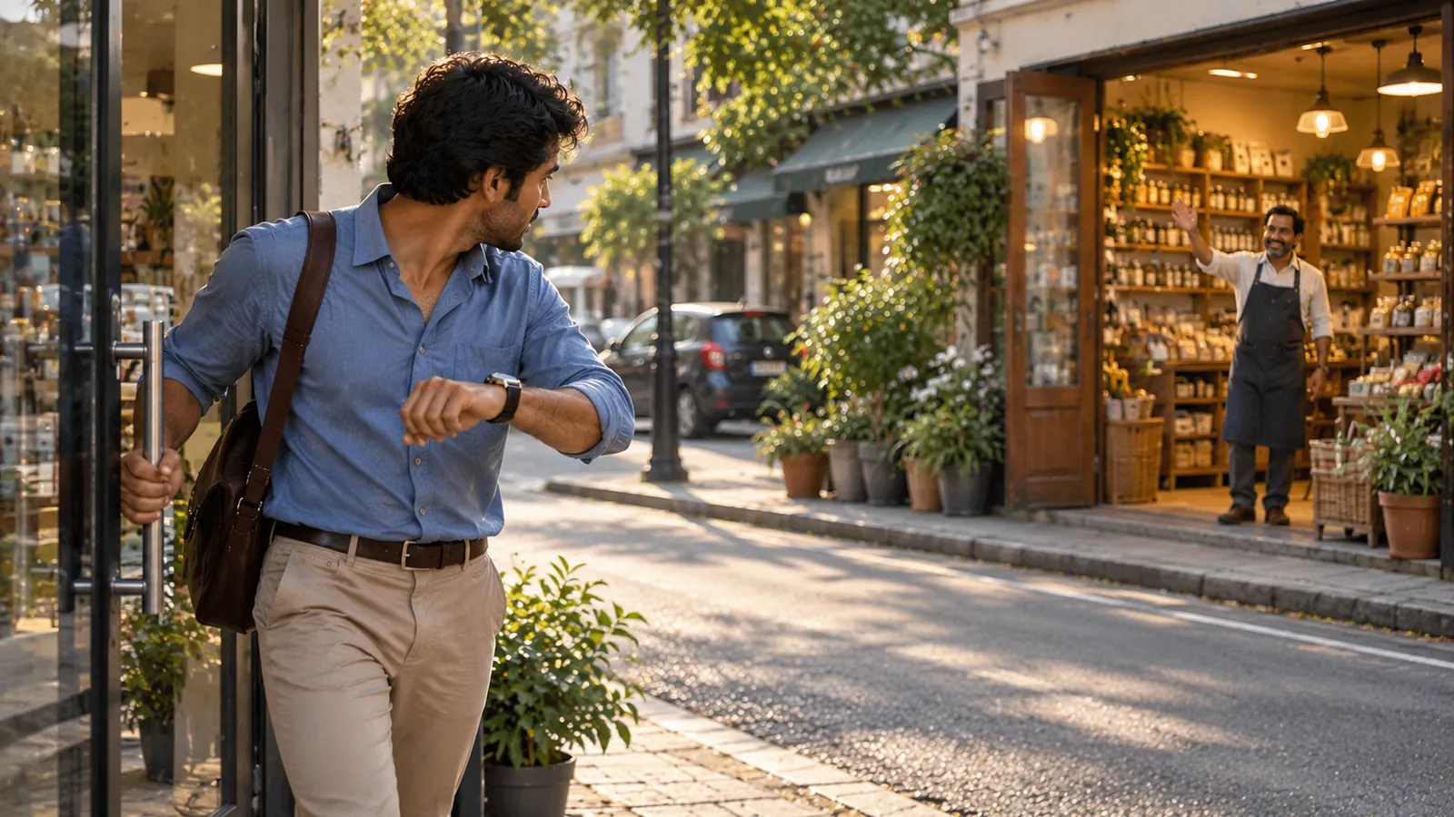
The headline is a promise about how the stay will feel: “Slow mornings, by design.” Behind it is a slow video of the house from the water at first light. There is no carousel of six offers and no “Welcome to our website”.
The booking bar sits on the first screen, overlapping the photo, with three short promises underneath: the rating, free cancellation and no booking fees. A guest can check dates without scrolling. You can see it in the screenshot at the top of this post.
For the hotel: the guest decides “this place looks lovely” before reading a word, and can check dates in the same second.
Step 03
Let them live a day there before they book
Before any room is shown, the homepage walks through one day at the house: 7am, a swim off the jetty; 1pm, lunch under the fig; 7pm, the copper hour on the terrace; 10pm, the library, lamps low. Each moment has one photo and one sentence.
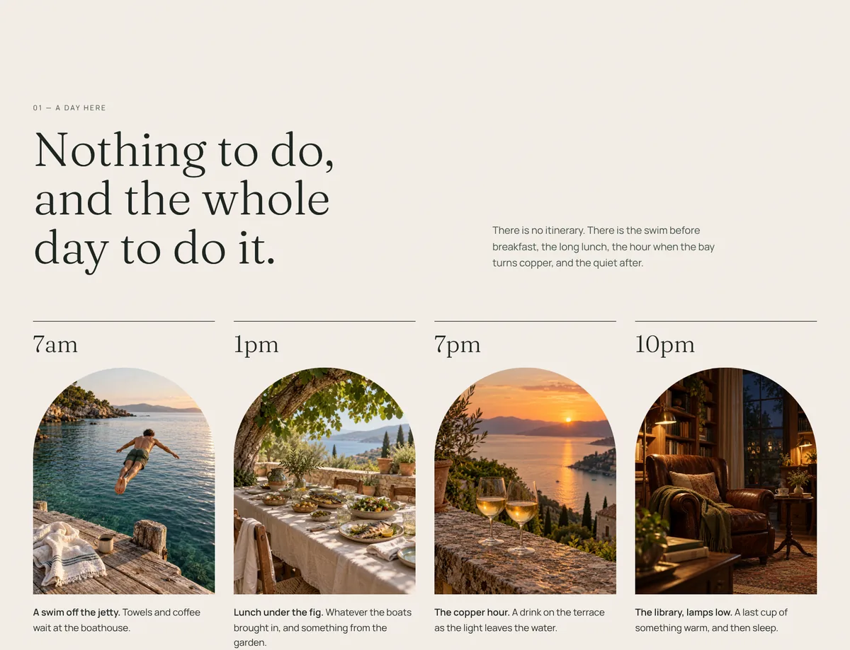
For the hotel: guests arrive at the room list already attached to the place, so they compare rooms at Halden House instead of comparing Halden House with other hotels.
Step 04
A calendar that shows the price of every night
Most hotel booking widgets show an empty calendar. You pick dates, wait, and only then find out the price. Halden House shows the “from” price under every date, and crosses out the nights that are full.
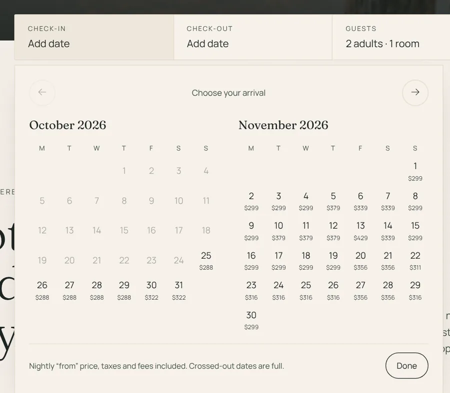
The note under the calendar says exactly what the number means, and it changes by market: taxes and fees included in the US, GST included in Australia, before GST in India. More on that in step 07.
For the hotel: guests who can move their dates pick quieter, cheaper nights on their own, which helps fill midweek rooms without a discount campaign.
Step 05
Four rooms, one clear favourite
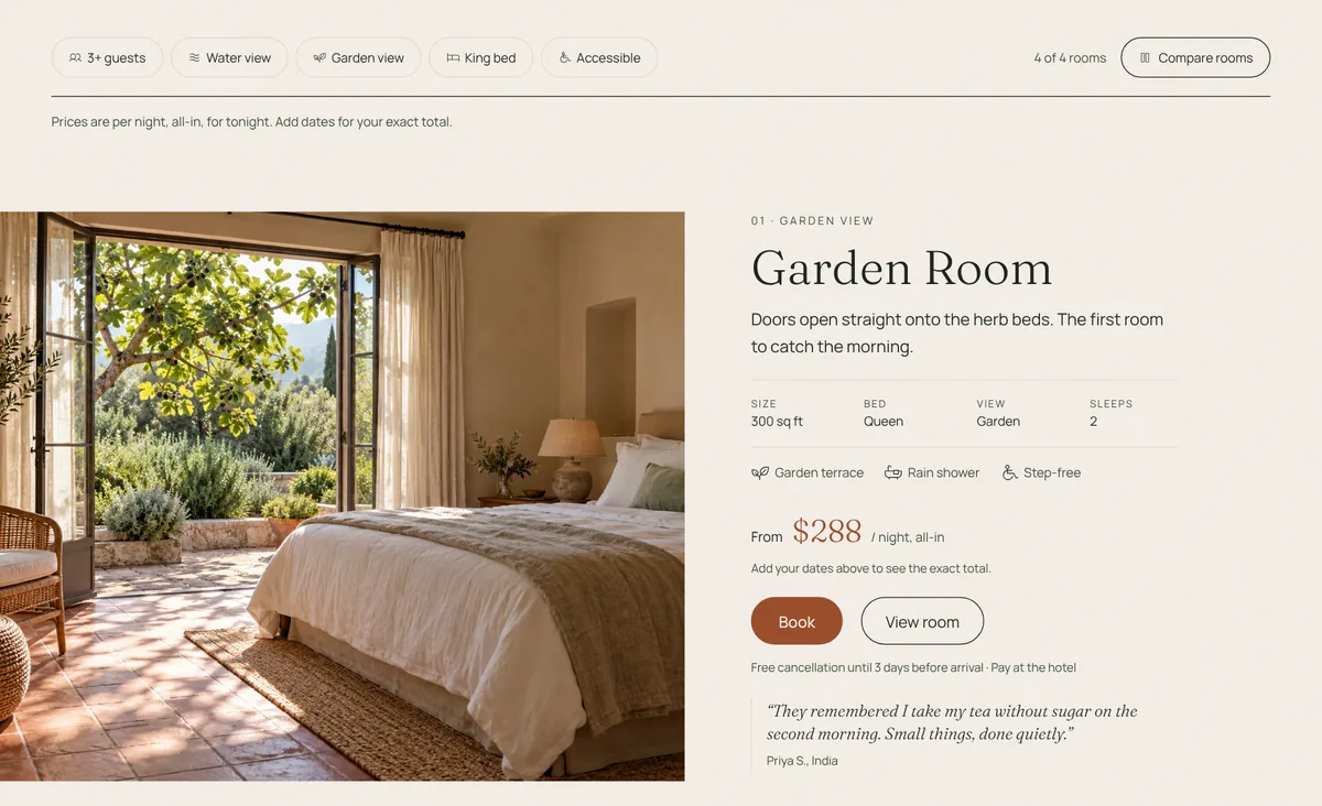
The house has 24 rooms but only four types, and the site keeps it that way: Garden Room, Water View Suite, Loft Room and Family Room. Each card has one line about the room, its size in the guest’s own unit, the “from” price per night all-in, and one review from a guest who stayed in that exact room.
One room carries a small badge: Most chosen by couples. A short filter row covers what people actually filter by, like 3+ guests, water view, king bed and step-free access, and Compare rooms puts all four side by side.
Step 06
A room page that tells you when it’s at its best
Each room page opens with a story, not a list. The Water View Suite “runs the width of the house, so the water is with you from bed to bath.” Under it is one line in italics: “Best at 6pm, when the bay turns copper.” The Loft Room’s says “Best at 10pm, lights off, skylight open.”
Then the key facts in a row, what’s in the room, a simple floor plan, the house rules for that room (children, pets, extra beds) and a sticky booking card on the right that shows the exact total for the guest’s dates, line by line.
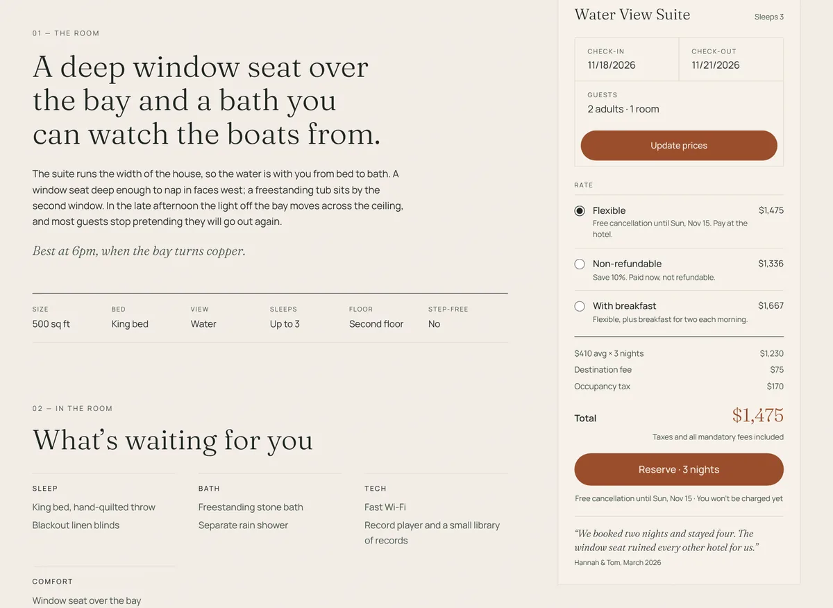
Lower down, the reviews are only from guests who stayed in that room.
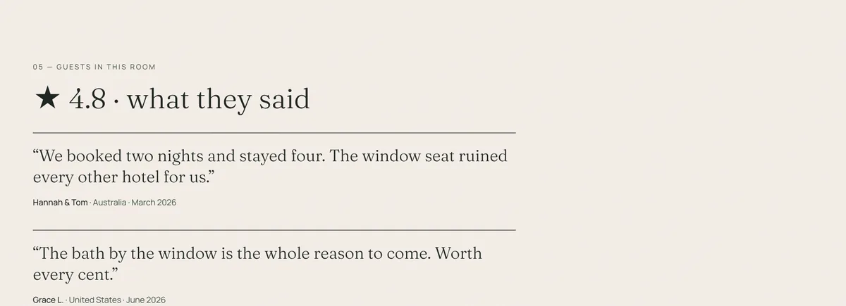
For the hotel: guests see the total, the trade-offs and the proof on one page, so fewer leave to “check the price on Booking.com”.
Step 07
Every price is the real price, in the guest’s own money
This is where most hotel sites lose people. The room says $240, and at checkout it becomes $290 with a “destination fee” and tax. Baymard’s 2024 survey found 48% of US online shoppers had abandoned a checkout because extra costs were too high (eMarketer, citing Baymard).
Halden House has a region switcher in the header (US $, IN ₹, AU $), and it picks the right one from the visitor’s browser. Each market sees prices the way its guests expect, and the way its rules require:
- United States: every price includes the room, the mandatory destination fee and the occupancy tax. Since 12 May 2025 the FTC’s fee rule requires hotels to show the total price, including all mandatory fees, from the start of booking (Barnes & Thornburg). Sizes in square feet, dates as MM/DD/YYYY, Apple Pay offered.
- India: GST is shown on its own line, at the right slab for each night. Since 22 September 2025, rooms up to ₹7,500 a night carry 5% GST, down from 12%, while rooms above ₹7,500 stay at 18% (Skift, AxisRooms). Sizes in m², UPI offered, Jain dishes marked on menus, and a WhatsApp button.
- Australia: prices include GST, and the summary shows how much of the total it is.
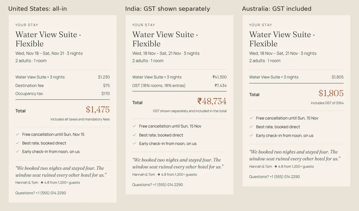
For the hotel: no checkout surprises means fewer abandoned bookings, and in the US it keeps the hotel on the right side of the FTC rule.
Step 08
Give people a reason to book direct
“Book direct” only works if booking direct is actually better. Halden House says why in three short lines on the homepage, and repeats them in every booking summary:
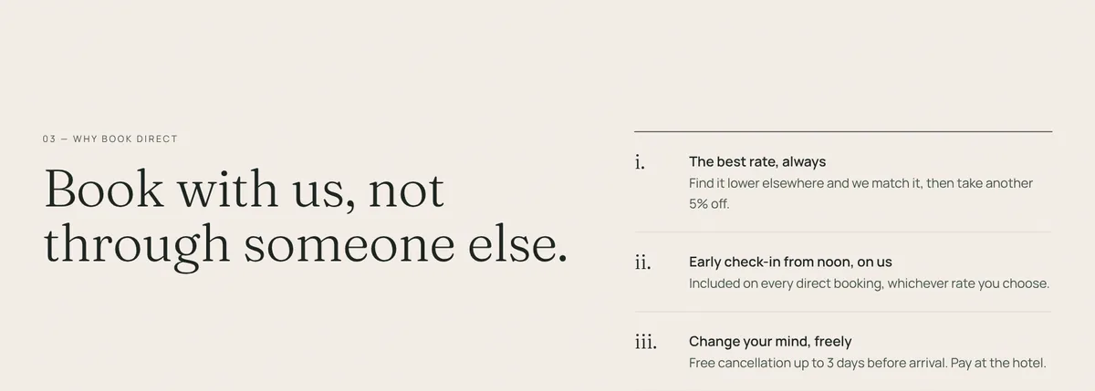
For the hotel: a perk that costs the hotel almost nothing beats the travel site’s loyalty points, and it’s only available on the hotel’s own site.
Step 09
Booking in three steps, no account needed
The booking flow has three steps, with a progress bar on top: Room & rate, Your details, Review & pay. The booking summary stays on the right the whole time, so the total never disappears.
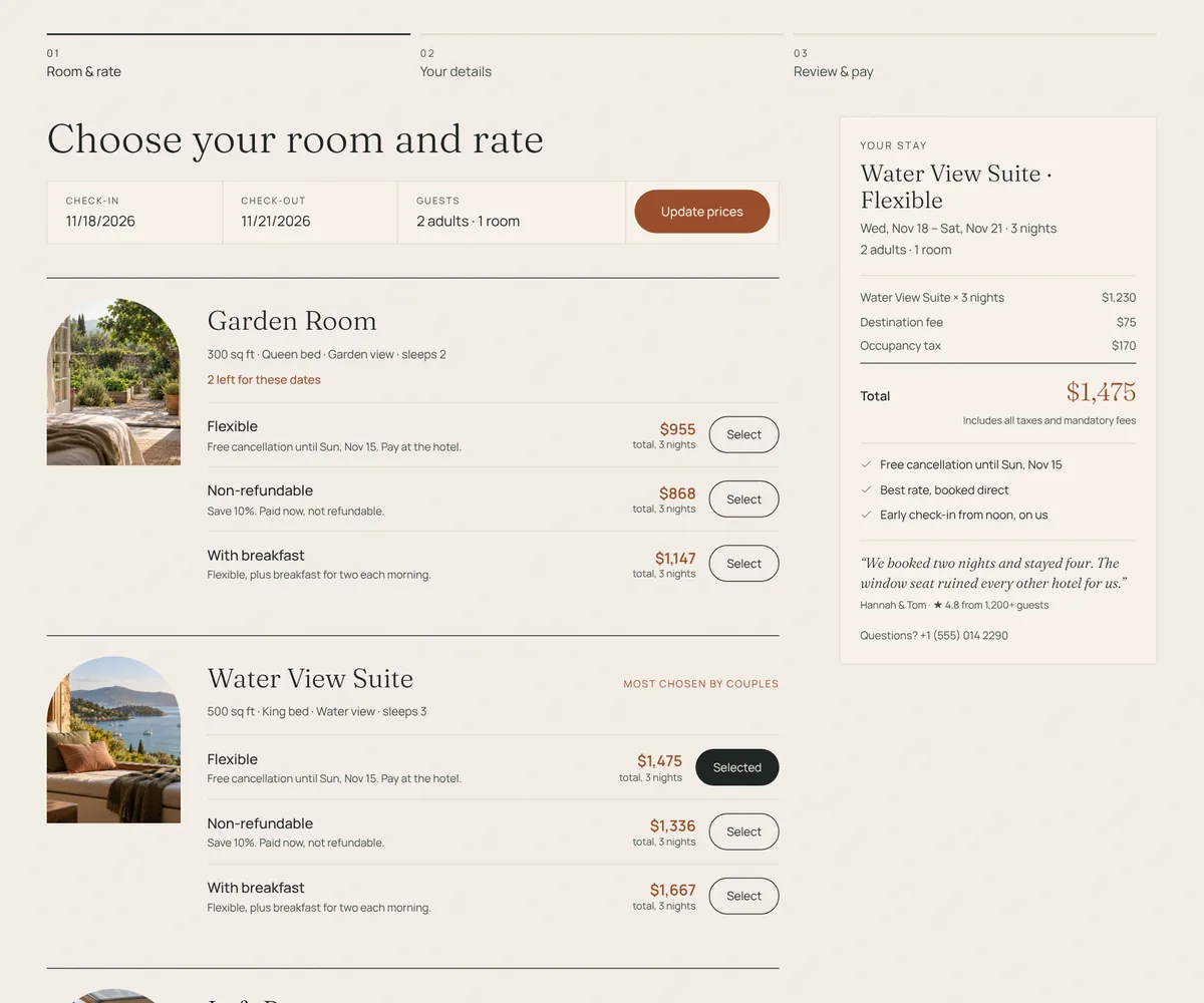
The details step asks only for a name, email and phone. There is no account to create and no password to invent. Under it, four optional extras, each with its price: airport pickup, late checkout, a spa ritual and a celebration setup.
The default rate is Flexible: free cancellation until 3 days before arrival, and pay at the hotel. Paying now and saving 10% is there for people who want it.
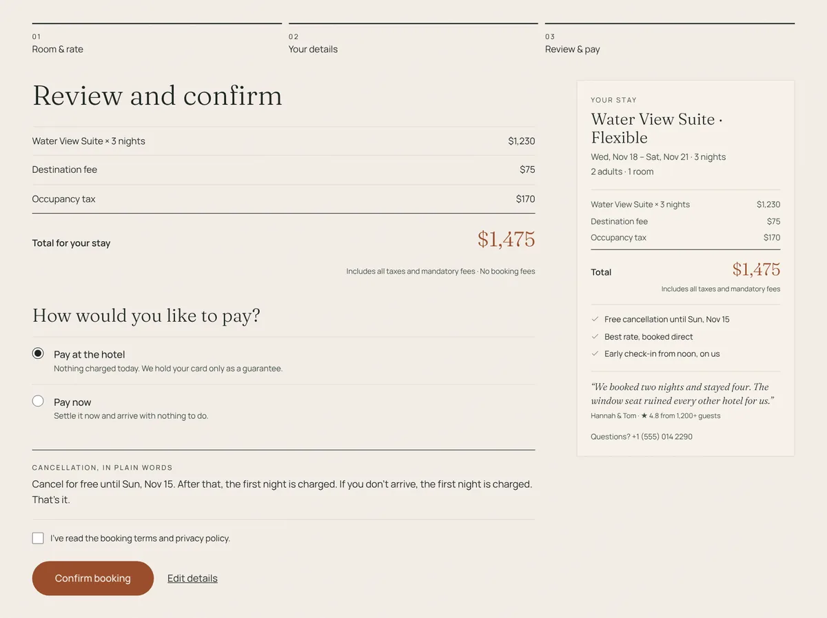
For the hotel: fewer people drop out halfway, and the optional extras add revenue at the moment guests are most excited about the trip.
Step 10
Cancellation and policies in plain words
Right above the confirm button is a box headed Cancellation, in plain words: “Cancel for free until Sun, Nov 15. After that, the first night is charged. If you don’t arrive, the first night is charged. That’s it.” The date is worked out from the guest’s own check-in date.
The full policies page follows the same idea. Its title is “The fine print, written plainly.”
For the hotel: guests book earlier, because they know exactly how to get out of it. Earlier bookings make planning and staffing easier.
Step 11
A confirmation page that ends on a high
Most confirmation pages say “Booking successful. Reference: 4F7A2”. Halden House says “See you on Wed, Nov 18, Grace.” Under it is a short note signed by the house manager, a few lines on When you arrive (your room is ready from 3pm, but arrive earlier and we’ll take your bags), and buttons to add the stay to your calendar, get directions or manage the booking.
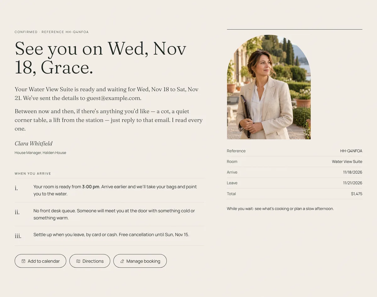
For the hotel: fewer “did my booking go through?” calls and emails, and a guest who is already looking forward to arriving.
Step 12
Real faces and names, with something to ask them
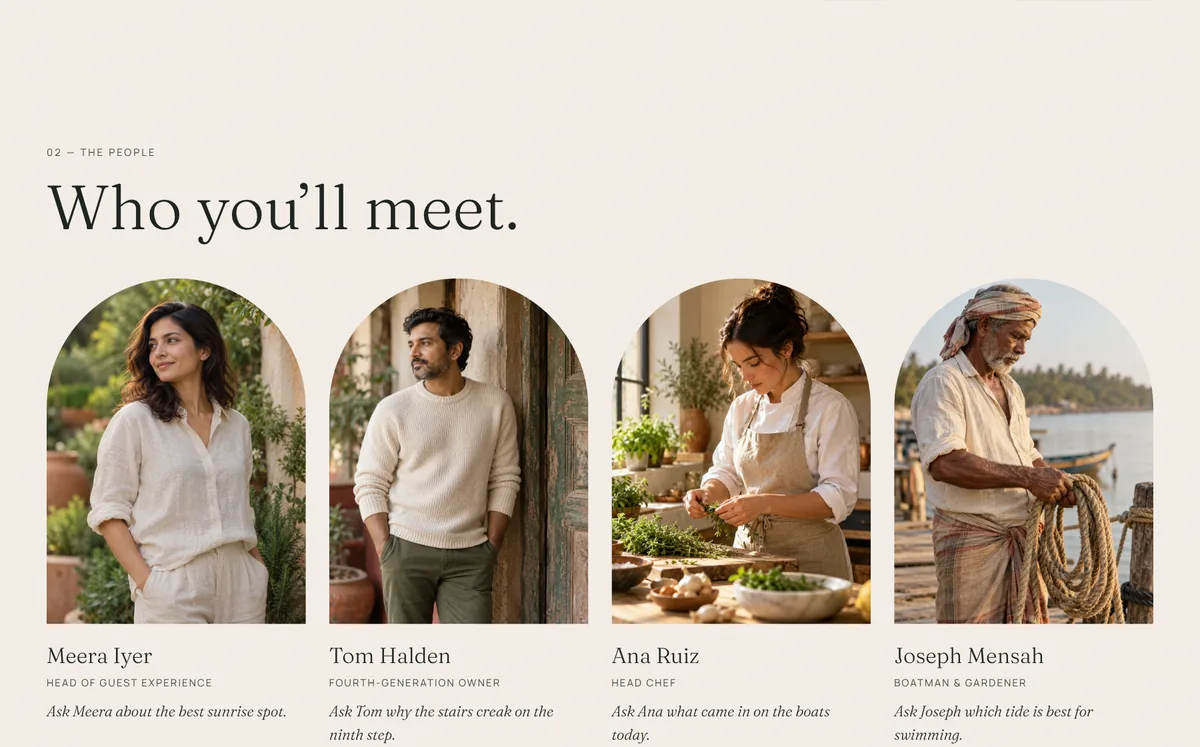
The About page introduces four people, each with a photo, a role and one thing to ask them: “Ask Meera about the best sunrise spot.” “Ask Tom why the stairs creak on the ninth step.” “Ask Ana what came in on the boats today.” Even the contact form promises “a real person will reply soon.”
Step 13
It works with one thumb on a phone
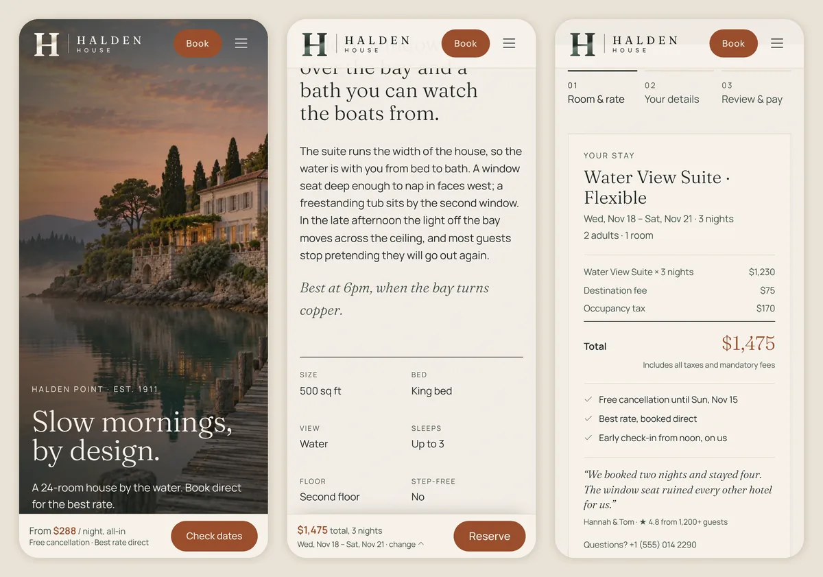
Many guests plan trips on a phone, often in bed or on the sofa. On a phone, Halden House keeps a bar fixed at the bottom of the screen with the price and one big button: From $288 / night, all-in · Check dates. On a room page it becomes the total for your dates and a Reserve button. The booking summary moves to the top of each step so the total is always the first thing you see.
Summary
The psychology at a glance
| Principle | Where it shows up | What it does |
|---|---|---|
| First impressions (50 ms) | Calm hero video, one headline | Sets a positive frame for everything after |
| Mental simulation | A day here, “best at 6pm” | Guests picture their stay and want it |
| Labor illusion | Prices on every calendar date | Openness feels like value |
| Choice overload | Four room types | Easier to decide, less to put off |
| Social proof (similar others) | “Most chosen by couples”, reviews per room | Guests follow people like them |
| Loss aversion | All-in prices, free cancellation | No surprise costs, no risk to fear |
| Processing fluency | Local currency, dates, units; plain policies | Easy to read feels honest |
| Zero-price effect | Early check-in “on us” | A small perk feels like a big reason |
| Goal gradient + defaults | Three steps, Flexible rate preselected | Fewer people drop out |
| Pain of paying | Pay at the hotel | Booking feels like planning, not spending |
| Peak-end rule | Warm, personal confirmation | The booking is remembered as easy |
| Liking | Staff faces and “Ask Meera…” | Warmth a travel site can’t offer |
| Fitts’s law | Bottom bar with price and button | Booking is always one tap away |
The business case
What moving bookings direct is worth
A quick, illustrative example. Say a small hotel takes 1,000 bookings a year, averaging $450 each, and 60% of them come through travel sites at an 18% commission.
| Today | 10% of bookings moved direct | |
|---|---|---|
| Bookings through travel sites | 600 | 500 |
| Commission paid (18%) | $48,600 | $40,500 |
| Kept by the hotel | — | $8,100 a year |
That is before counting the guest emails the hotel now owns, the extras sold during booking, and the repeat stays that come from guests who booked with you, not with a travel site. These numbers are an example, not a promise; your own mix and commission rates will differ.
Steal this
Steal this for your own hotel website
- Put a booking bar on the first screen, with free cancellation and “no booking fees” under it.
- Show a price under every date in the calendar.
- Make every price the full price, including mandatory fees. In the US, that is the law.
- Keep room types few, and mark the most popular one.
- Show reviews from guests who stayed in that exact room.
- Give three reasons to book direct that a travel site can’t match.
- Three booking steps, no account, Flexible rate as the default.
- Write the cancellation rule in one plain sentence with the real date.
- End with the guest’s name, their arrival day and a real person’s welcome.
- On phones, keep the price and the booking button fixed at the bottom.
Want this for your hotel, homestay or resort? I build it end to end: design, booking flow, connection to your booking engine or channel manager, and the pricing rules for your market. Try the Halden House demo, book a free 15-minute call or email sud@sudbuilds.com.
Questions
Frequently asked questions
Can this connect to my booking engine or channel manager?
Yes. In the demo, prices and availability come from two small functions with sample data. For a real hotel they call your booking engine or channel manager, so the calendar, rates and rooms left are always live.
Will showing all-in prices make my rooms look more expensive than on Booking.com?
In the US, travel sites must show mandatory fees in the total too, under the FTC rule in force since May 2025, so you are comparing like with like. In India and Australia the site follows the usual local format. A clear total usually wins trust rather than losing bookings.
I only have 6 rooms. Is this too much?
The same ideas work at any size: a priced calendar, all-in totals, a short booking flow and plain cancellation terms. A smaller property simply has fewer room cards and pages.
Can guests pay by UPI or pay at the hotel?
Yes. The payment options change by market: UPI and cards in India, Apple Pay and cards in the US, PayPal and cards in Australia, and pay at the hotel on flexible rates everywhere.
Do I still need to be on travel sites?
Usually, yes. They bring guests who would never have found you. The goal is that when those guests check your own site, they book there, saving you the commission.
Further reading
Sources
The rules and research mentioned in this post (psychology studies are cited by author and year in the text):
- What OTAs actually cost in 2026, Hotel Online.
- Listings on third-party sites increase bookings on a hotel’s own website (Cornell billboard effect study), Reuters Events.
- Cornell study shows promotion effect of online travel sites, Hospitality Net.
- Extra costs are the No. 1 reason consumers abandon online carts, eMarketer (Baymard 2024 survey).
- FTC finalizes junk fees rule: new pricing disclosure requirements take effect May 12, 2025, Barnes & Thornburg.
- India updates consumption tax rules: what is changing for the tourism industry, Skift.
- Hotel GST 2025: what changed, AxisRooms.
- A room with a viewpoint: conservation messages and motivation, ScienceDaily.