Case study · Dental clinic website · 24 pages
A dental websitebuilt for people whodread the dentist.
Most people don’t avoid the dentist because they don’t need one. They avoid it because of fear, cost and not knowing what will happen. Archis is a full dental clinic website I designed to remove those barriers one by one. Here’s every page, and the psychology behind why a nervous visitor would choose this clinic and book.
In one minute
- Built around the seven reasons people don’t book a dentist: fear of pain, the unknown, the bill, shame, effort, trust and putting it off.
- Painless, upfront, no judgment: the three promises the whole site keeps.
- A symptom picker that tells you what your problem probably is, how soon to come and what it costs.
- Prices on every card, a written promise of no surprise charges, and EMI.
- Booking in three taps, name and phone only, with Call, WhatsApp and Book always one tap away.
Who this is for
Dental clinics, and any healthcare practice where fear and price uncertainty stop people from booking: dermatology, physiotherapy, eye clinics, IVF.
Every idea here works on an existing site too. There’s a checklist at the end.
Jump to the checklistOn this page
- The seven reasons people don’t book
- A look that feels safe, not expensive
- The hero: three fears answered in five seconds
- Naming the worries out loud
- “What brings you in?”
- Treatments with the price on the card
- Your first visit, minute by minute
- A doctor who speaks first
- “Most of them were scared too”
- Smile results, honestly labelled
- The cost of waiting
- Hygiene you can watch
- A prices page with a promise
- Treatment pages that answer “Does it hurt?”
- Booking in three taps
- One tap away, on every screen
- Build notes
- How this turns visitors into patients
- The psychology at a glance
- Steal this for your own website
- Questions people ask
- Sources and further reading
Think about the last time you put off a dentist appointment. It probably wasn’t because you didn’t have time. It was the thought of the injection, the drill, being told off for not coming sooner, and the bill at the end that might be five times what you expected.
Most dental websites ignore all of that. They list treatments, show a model with perfect teeth and say “state-of-the-art care”. None of it answers the question the visitor is actually asking: is this going to be okay?
So I designed Archis the other way round. Every page has one job: help an anxious person feel safe enough to book. Psychology drives the structure, not decoration. Here’s how it’s built, page by page.
Archis Dental Clinic is a fictional demo. The clinic, doctors, reviews, prices, photos, address and phone number are not real, and any resemblance to a real business or person is coincidental. The photos are AI-generated placeholders. For a real clinic, every number gets replaced with the clinic’s own, reviews come from Google word for word, and before-and-after images are real cases shared with written consent.
Step 01
The seven reasons people don’t book
Before designing anything, I wrote down what stops people from booking a dentist, and what the website could do about each one. This table became the brief. If a section didn’t answer one of these, it didn’t make the cut.
| What holds people back | What the site does about it |
|---|---|
| Fear of pain, the biggest one | “Painless” up front, calm photos of relaxed patients, an honest “Does it hurt?” on every treatment, and no drills or needles shown anywhere |
| Fear of the unknown | “Your first visit, step by step”, a full “Nervous? Read this first” page, and real faces of the doctors before booking |
| Cost anxiety and fear of being upsold | Price ranges in ₹ on every card, “No treatment without your approval”, and EMI from ₹1,500 a month |
| Shame: “my teeth are too far gone” | No-judgment language: “Haven’t been in 10 years? That’s fine.” Ordinary smiles, not model teeth |
| Effort and friction | Three-step booking, WhatsApp on every screen, and a live “Open now · next slot” bar |
| Trust | Reviews from people who were scared too, qualifications and registration numbers, hygiene you can watch |
| Putting it off | A gentle cost-of-waiting comparison and a free first consultation |
Step 02
A look that feels safe, not expensive
I avoided the two usual looks. Hospital teal and white feels cold and clinical. The luxury “smile studio” look, with serif headlines and cream and gold, quietly says this will be expensive, which is the exact fear I’m trying to remove.
Archis is “Clear & Human”:
- Bright and clean: white and soft grey, near-black text, one confident cobalt blue for every action, and a soft mint used only for reassurance (“Painless”, “Free consultation”, “Price told upfront”).
- One friendly font (Plus Jakarta Sans), heavy for headlines, with big, bold numbers for prices and stats so they’re impossible to miss.
- Real-looking photos do the talking. Every major section has a photo of a calm moment: someone laughing in the chair, a doctor listening at eye level, a couple looking at a treatment plan. No instruments in use, no needles, no open mouths.
Step 03
The hero: three fears answered in five seconds
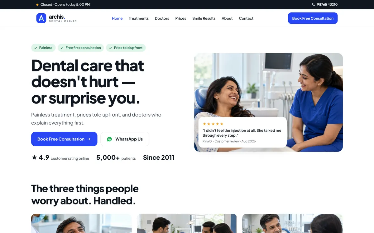
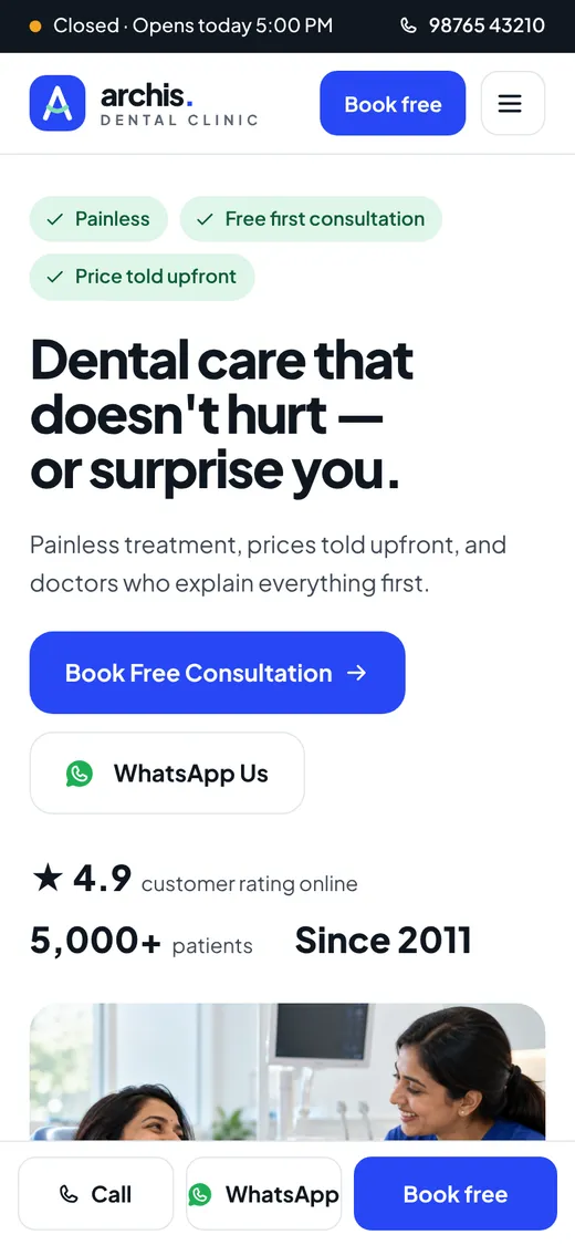
The headline is “Dental care that doesn’t hurt — or surprise you.” It names two fears, pain and the bill, in eight words. The line underneath adds the third: “Painless treatment, prices told upfront, and doctors who explain everything first.”
Around it, everything has a job:
- Three mint chips above the headline: Painless · Free first consultation · Price told upfront.
- Two buttons: “Book Free Consultation” and “WhatsApp Us”, for people who would rather message than fill in a form.
- Three proof numbers: ★ 4.9 rating, 5,000+ patients, Since 2011.
- A review card on the photo: “I didn’t feel the injection at all. She talked me through every step.” It’s placed right where the eye lands after the headline.
- A live status bar at the very top: “Open now · next slot today 4:30 PM” or “Closed · Opens today 5:00 PM”, worked out from the clinic hours.
Step 04
Naming the worries out loud
The first section after the hero is titled “The three things people worry about. Handled.” Three photo cards, each with a mint chip and a promise written in plain words:
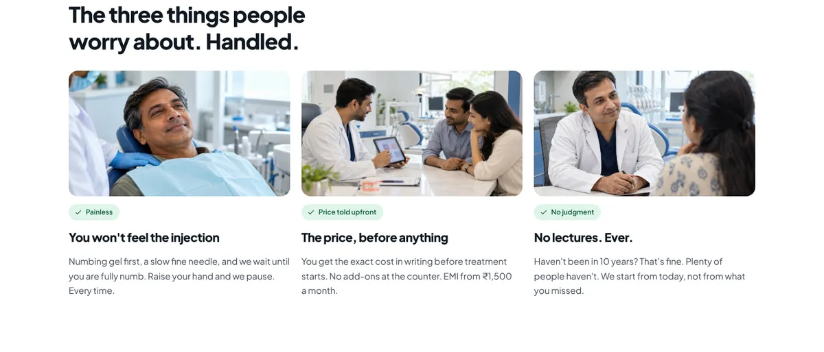
- “You won’t feel the injection.” Numbing gel first, a slow fine needle, and we wait until you’re fully numb. Raise your hand and we pause.
- “The price, before anything.” The exact cost in writing before treatment starts. No add-ons at the counter. EMI from ₹1,500 a month.
- “No lectures. Ever.” “Haven’t been in 10 years? That’s fine. Plenty of people haven’t. We start from today, not from what you missed.”
Step 05
“What brings you in?”
Most visitors arrive with a problem, not a treatment name. They don’t search “endodontic therapy”. They think my tooth hurts when I drink something cold. So the homepage has a symptom picker: eight chips (Tooth pain, Sensitivity, Bleeding gums, Broken tooth, Missing tooth, Yellow teeth, Crooked teeth, Kid’s checkup).
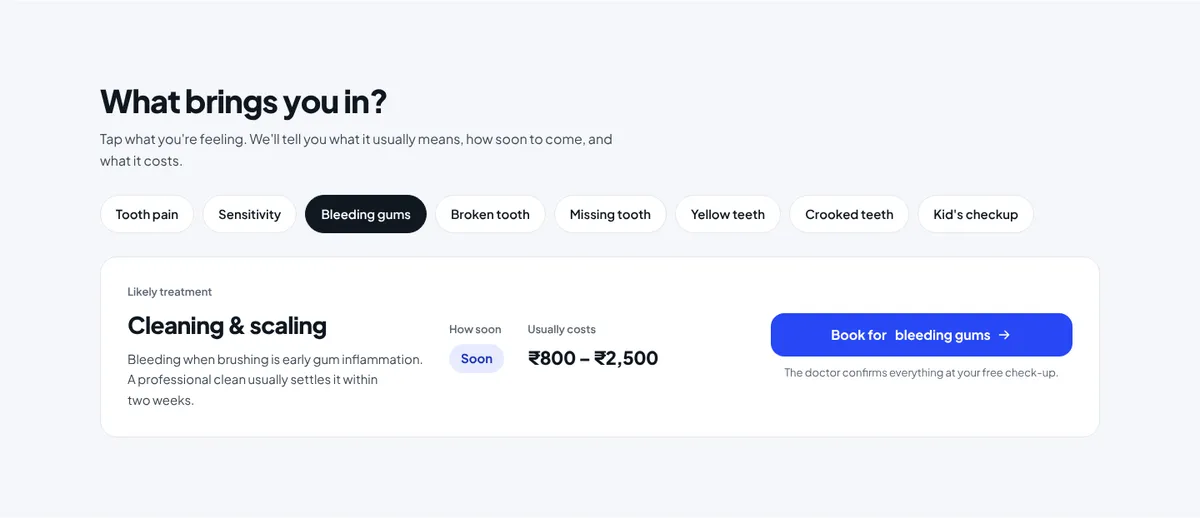
Tap one and you get three answers at once: what it probably is, how soon to come (Routine, Soon or Today) and what it usually costs. Under the Book button: “The doctor confirms everything at your free check-up.”
For the clinic: the booking form already knows the problem, so the front desk can plan the right slot length, and the patient never has to explain it twice.
Step 06
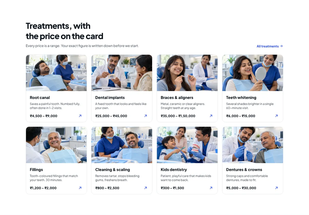
Treatments with the price on the card
Eight treatment cards, each with a photo, one line on what it does for you, and a price range in rupees: root canal ₹4,500–₹9,000, fillings ₹1,200–₹2,000, implants ₹25,000–₹45,000. The section line is direct: “Every price is a range. Your exact figure is written down before we start.”
Step 07
Your first visit, minute by minute
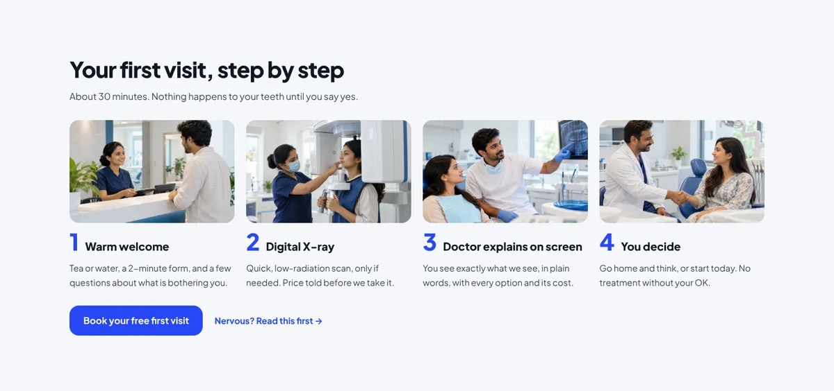
The unknown is often scarier than the procedure. So the homepage walks through the first visit in four photo steps: Warm welcome → Digital X-ray → Doctor explains on screen → You decide. The line above it does the heavy lifting: “About 30 minutes. Nothing happens to your teeth until you say yes.”
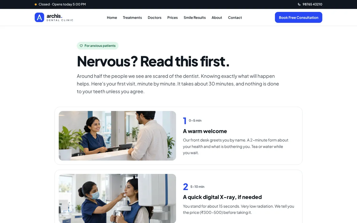
For people who need more, there’s a whole page: “Nervous? Read this first.” It covers what happens at each step, what to bring, how long it takes, what it costs, and the ways the clinic helps people stay calm: a hand signal that stops everything, music or headphones, numbing gel before any injection, and mild sedation for very anxious patients.
Step 08
A doctor who speaks first
Instead of a team grid with titles, the homepage introduces one dentist in his own words, under a quote: “I’ll never start anything you haven’t understood and agreed to.”
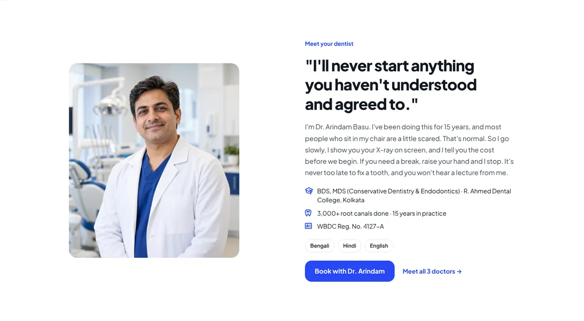
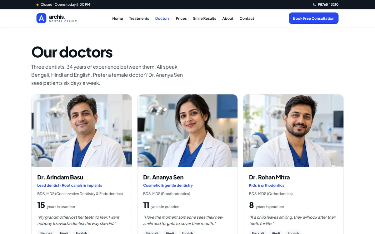
The note is warm and plain: “Most people who sit in my chair are a little scared. That’s normal. So I go slowly, I show you your X-ray on screen, and I tell you the cost before we begin… It’s never too late to fix a tooth, and you won’t hear a lecture from me.” The Doctors page then shows all three dentists, the languages they speak (Bengali, Hindi, English), and a line many patients look for: “Prefer a female doctor? Dr. Ananya Sen sees patients six days a week.”
Step 09
“Most of them were scared too”
The reviews section isn’t titled “Testimonials”. It’s titled “Most of them were scared too.” The reviews chosen for the demo are about fear and price, not about “great service”: someone who put off a root canal for two years, someone who got the full price on a sheet before starting, a parent whose six-year-old had screamed at the last clinic.
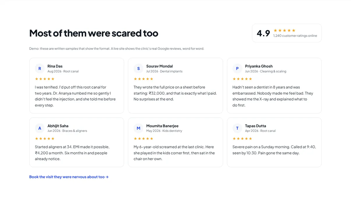
The link under the reviews closes the loop: “Book the visit they were nervous about too →”.
Step 10
Smile results, honestly labelled
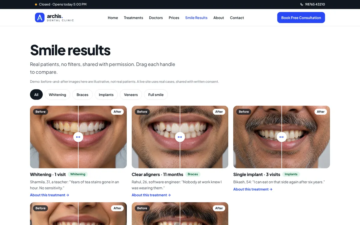
The Smile Results page has draggable before-and-after sliders, filterable by Whitening, Braces, Implants, Veneers and Full smile. Each one includes the number of visits and a short line from the patient, like “Coffee stains gone in an hour. I smile in photos again.”
Step 11
The cost of waiting
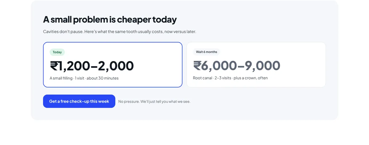
This is the gentlest push on the site. A small section called “A small problem is cheaper today” compares the same tooth now and later:
Step 12
Hygiene you can watch
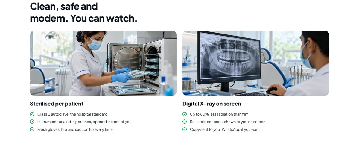
The hygiene section is titled “Clean, safe and modern. You can watch.” Instead of “we follow the highest standards”, it lists what you’ll see: a Class B autoclave, instruments sealed in pouches and opened in front of you, fresh gloves, bib and suction tip every time, and digital X-rays shown to you on screen and sent to your WhatsApp if you want them.
Step 13
A prices page with a promise
The prices page is titled “Prices, told upfront.” A table lists every treatment with its price range, number of visits and exactly what’s included. Next to it is a boxed promise: “No hidden charges. No treatment without your approval. If anything changes during treatment, we stop and ask first.”
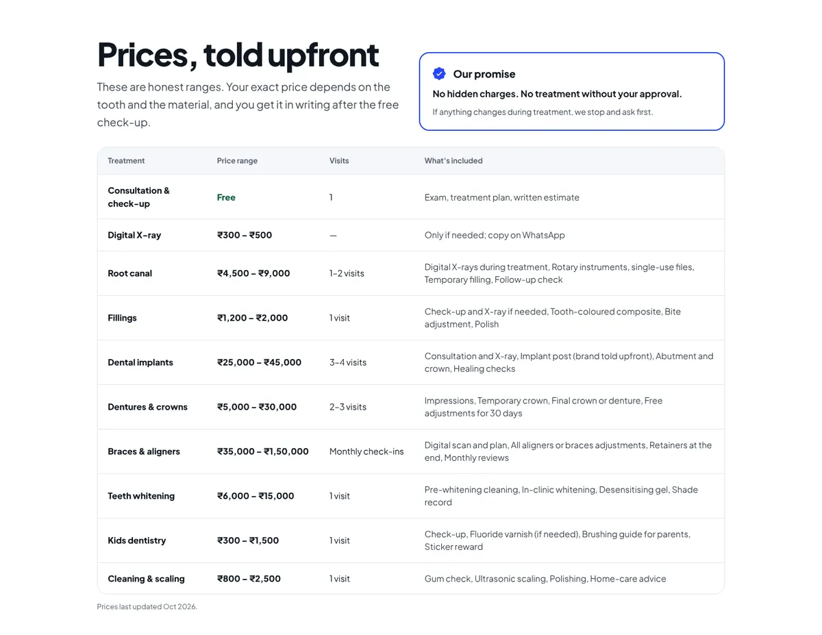
Below the table: 0% EMI over 3–12 months for treatments above ₹10,000 (“₹2,500/month for a ₹30,000 implant over 12 months”), every way to pay (UPI, cards, cash, pay per visit), and an honest note that most Indian health policies only cover dental after an accident, with an offer to help with the paperwork when they do.
For the clinic: people who book already know roughly what they’ll pay, so consultations end in a “yes” more often, and the front desk spends less time on price calls.
Step 14
Treatment pages that answer “Does it hurt?”
Each of the eight treatments has its own page, built from one template: a hero photo, an “Is this for you?” checklist of symptoms you can tick, an honest “Does it hurt?” answer, the steps with photos, visits, duration, price and EMI, a result, three related reviews and treatment-specific questions.
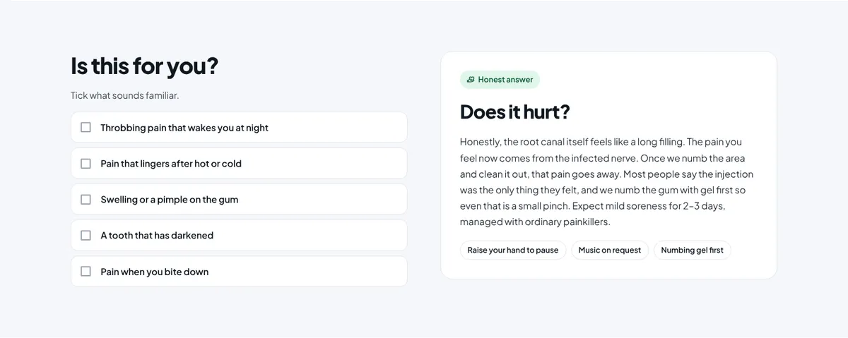
Ticking symptoms gives live feedback (“2 signs match. Worth a quick, free look.”). The pain answer doesn’t promise “zero pain”. It says what it actually feels like, what they do about the injection, and what to expect afterwards: “mild soreness for 2–3 days, managed with ordinary painkillers.”
Step 15
Booking in three taps
The booking page asks for as little as possible: 1. What’s the problem? → 2. Pick a day and time → 3. Your name and phone. That’s it. No email, no date of birth, no account. If you came from the symptom picker or a treatment page, step 1 is already filled in.
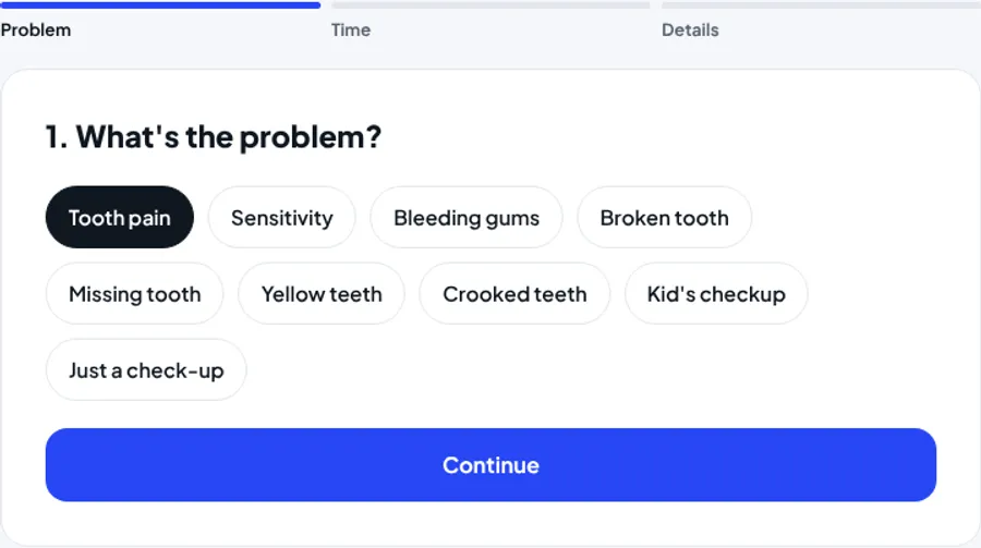
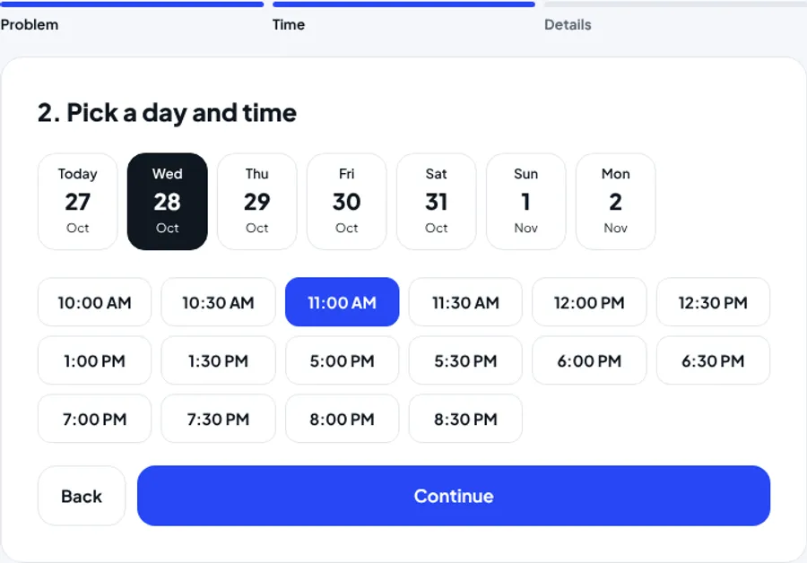
Under the phone field: “We’ll only use this to confirm your visit. No spam, no marketing calls.” The confirmation screen says what happens next (a WhatsApp confirmation, a reminder the day before) and offers Add to calendar and a link to “What to expect”.
Step 16
One tap away, on every screen
Most people find a dentist on their phone, often while in pain. On mobile, a bar stays fixed at the bottom of every page with three buttons: Call · WhatsApp · Book free. On desktop a WhatsApp button floats in the corner, with a pre-written message so the patient doesn’t have to think of what to type.
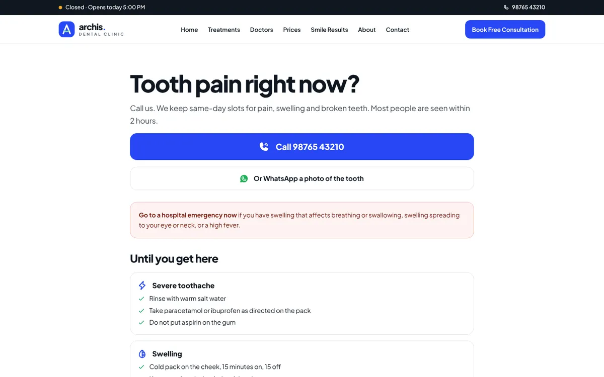
There’s also an Emergency page for the person searching at 11 pm with a swollen face: “Tooth pain right now?” with a big Call button first, “Or WhatsApp a photo of the tooth”, what to do until you arrive, and a clear warning about when to go to a hospital instead.
Step 17
Build notes
The site is 24 pages: Home, Treatments, eight treatment pages, Doctors, Prices, Smile Results, About, First Visit, Book, Emergency, FAQ, Blog with an article, Contact, Privacy, Terms and a 404.
- Plain HTML, Tailwind and a little vanilla JavaScript. Tailwind is compiled ahead of time into one 30 KB stylesheet, the font is self-hosted, and the icon fonts are cut down to only the 41 icons the site uses (9 KB instead of about 280 KB). No frameworks, no build step needed to open it.
- Everything interactive is small: the open/closed status, symptom picker, before-and-after sliders, FAQ accordions, symptom checklists and the booking flow all run from one script.
- Accessibility: one heading per page in order, real buttons and labels, visible focus, keyboard-friendly accordions and sliders, alt text on every photo, and motion turned off for anyone whose device asks for less.
- Search: a unique title and description per page, and
Dentiststructured data with the address, hours and phone. For a real clinic, the treatment pages are the ones that rank, because they answer what people search: cost, visits and “does it hurt”. The demo itself is set to noindex so a made-up clinic never appears in search. - The patient app from the first version of Archis is still online as a separate prototype, for clinics that run long treatments like aligners or implants. Open the patient app.
Step 18
How this turns visitors into patients
More people find it
- Treatment pages with prices and honest pain answers match what people actually search. Few clinics answer these questions, so there’s less competition.
- An emergency page catches the most urgent searches, from people ready to book right now.
- Real Google reviews linked from the site support local ranking and clicks.
More of them book
- Every big fear (pain, the unknown, cost, shame, hygiene) is answered before the first visit.
- The symptom picker and treatment pages lead straight into a pre-filled booking form.
- Booking takes three taps, and Call, WhatsApp and Book are on every screen.
More of them come back
- Patients who were told the truth about pain and price leave reviews that say “easier than I thought”, which bring in the next nervous patient.
As with every project, I don’t promise numbers in advance. On a live site, analytics track each booking step, and we fix whichever step loses the most people first.
At a glance
The psychology at a glance
Every principle used on the site, where it shows up, and what it does for the visitor.
| Principle | Where it’s used | What it does |
|---|---|---|
| Name the fear | “Dental care that doesn’t hurt — or surprise you” | Instant “they get it” |
| Affect heuristic | Calm photos, no needles or drills | The chair feels safer |
| Permission to return | “No lectures. Ever.” | Removes shame |
| Self-reference effect | “What brings you in?” symptom picker | Feels understood, finds the answer fast |
| Transparency | Prices on every card and a full prices page | Removes fear of the bill |
| Predictability | First visit step by step, “Nervous? Read this first” | No unknowns |
| Perceived control | Raise your hand and we stop; nothing happens until you say yes | Less fear, no fear of upselling |
| Liking and authority | A doctor’s first-person note, then qualifications | Trust in a person, not a brand |
| Similar social proof | “Most of them were scared too” | “People like me were fine” |
| Loss aversion | ₹1,200 today vs ₹6,000 in six months | Book this week, not some day |
| Effort heuristic | Sterile pouches opened in front of you | Hygiene you can see |
| Pain of paying | EMI per month, what’s included, free consultation | Treatment feels affordable |
| Honest expectations | “Does it hurt?” answered truthfully | Better visits, better reviews |
| Default effect | Booking pre-filled from the symptom you picked | Fewer drop-offs |
| Less friction | Name and phone only; Call · WhatsApp · Book on every screen | More bookings |
Your turn
Steal this for your own website
You don’t need a new website to use these. Most can go on the one you have this week.
- Write your patients’ fears in their words, and make sure every section answers at least one.
- Say “painless” only if you can explain how: numbing gel, a fine needle, a stop signal.
- Put a price range on every treatment and a written “no surprise charges” promise.
- Add a “first visit, step by step” section with times, and say nothing happens until they agree.
- Remove judgment from your copy. Tell people it’s never too late.
- Show reviews from people who were nervous, and only ever real ones.
- Cut your booking form to name and phone, and put Call and WhatsApp on every screen.
Questions
Questions people ask
How much does a dental clinic website cost?
It depends on what it needs to do. A website with booking requests is a smaller project than one connected to your practice software. Tell me what you have and I’ll give you a fixed quote before starting.
Is it a good idea to publish dental prices online?
For most clinics, yes. Fear of the bill is one of the biggest reasons people don’t book. Publish honest ranges, and give the exact figure in writing after the check-up.
Won’t talking about pain on the website scare people off?
No. People are already thinking about pain. Saying nothing leaves them to imagine the worst. Naming the fear and answering it honestly, with what you actually do to prevent pain, is what makes them feel safe enough to book.
Can the booking connect to our clinic software or WhatsApp?
If your software has an API or calendar sync, bookings can go straight in. If not, they can arrive on WhatsApp or email in a fixed format for the front desk.
Can we use AI-generated photos on a real clinic website?
For rooms and general scenes they can work as placeholders, but before-and-after results and reviews must be real, shared with the patient’s written consent. Showing invented results as real ones misleads patients.
Further reading
Sources and further reading
The principles above come from published research and long-standing practice in psychology and usability. If you want to read further:
- Cialdini, R. B. Influence: The Psychology of Persuasion.
- Kahneman, D. & Tversky, A. (1979). Prospect theory: an analysis of decision under risk. Econometrica.
- O’Donoghue, T. & Rabin, M. (1999). Doing it now or later. American Economic Review.
- Slovic, P., Finucane, M., Peters, E. & MacGregor, D. (2007). The affect heuristic. European Journal of Operational Research.
- Symons, C. S. & Johnson, B. T. (1997). The self-reference effect in memory: a meta-analysis. Psychological Bulletin.
- Iyengar, S. S. & Lepper, M. R. (2000). When choice is demotivating. Journal of Personality and Social Psychology.
- Kruger, J., Wirtz, D., Van Boven, L. & Altermatt, T. W. (2004). The effort heuristic. Journal of Experimental Social Psychology.
- Prelec, D. & Loewenstein, G. (1998). The red and the black: mental accounting of savings and debt. Marketing Science.
- Johnson, E. J. & Goldstein, D. (2003). Do defaults save lives? Science.