Case study · Pet clinic & grooming website
A pet clinic websitebuilt around onenervous pet parent.
Wolk is a vet clinic and grooming spa website I designed and built as a demo. This is the full walkthrough: what I built, in what order, and the human psychology behind each decision, so the page turns a worried visitor into a booked appointment.
In one minute
- The site is built around the visitor’s worry, not the clinic’s services.
- Typing the pet’s name personalises the whole site: headline, buttons, booking.
- Prices are on the page, with three grooming packages and a clear middle choice.
- Booking is four short steps with a progress bar, plus WhatsApp and call on every screen.
- Every section maps to a named psychology principle, listed in a table at the end.
Who this is for
Vet clinics, grooming salons, pet boarding and any local service where the customer is anxious about someone they love.
Every idea here works on an existing site too. There’s a checklist at the end.
Jump to the checklistOn this page
- Start with the person, not the page
- A hero that answers three questions in five seconds
- Ask for the pet’s name, then use it everywhere
- Name the worry before it becomes a reason to leave
- Four doors instead of forty links
- Show the result: the before-and-after slider
- Put faces on the people who will hold the pet
- Prices on the page, with a middle option that feels right
- Social proof from people who felt the same
- A booking flow that feels like a conversation
- Remove the fear of the unknown: the visit page
- Give them a reason to come back
- Built for thumbs: the phone layout
- The build: tech, speed and search
- How this brings in more pet parents
- The psychology at a glance
- Steal this for your own website
- Questions people ask
- Sources and further reading
People don’t visit a vet’s website the way they visit a shoe shop. They arrive worried. Their dog has been limping, the cat has stopped eating, the puppy needs its first shots and they’ve heard stories. The person reading is anxious on behalf of someone who can’t speak for themselves. That changes everything about how the page should work.
Most clinic websites ignore this. They open with a stock photo, a paragraph about “state-of-the-art facilities” and a contact form. Nothing in that layout lowers the visitor’s heart rate, so most of them leave and call whoever their friend recommended.
With Wolk I set myself one rule: every section has to reduce a specific worry or remove a specific step. Below is each step in the order I built it, with the screenshot, what it does and the psychology behind it.
Wolk is a design demo. The clinic, people, prices, ratings and reviews are fictional placeholders, and for a real client they get replaced with real ones before launch. The design decisions and the psychology are what this post is about.
Step 01
Start with the person, not the page
Before drawing anything I wrote down who actually lands on a pet clinic site and what is going through their head. Three people kept coming up:
- The worried parent. Something is wrong and they need to know whether to come in, how fast, and whether their pet will be handled gently.
- The planner. Vaccines, a check-up or a groom. They’re comparing prices and convenience.
- The emergency. It’s late at night and they need a phone number now.
I also wrote down their questions in their own words: Will they be rough with him? How much will it cost? Can I stay with her? Is it clean? Those four questions became the backbone of the site. You’ll see them again in step 4.
I also chose the vocabulary at this stage. The site says “pet parent” and “your baby”, never “owner” or “patient”. That’s how most people in India talk about their pets, and it signals that the clinic sees the relationship the same way.
Step 02
A hero that answers three questions in five seconds
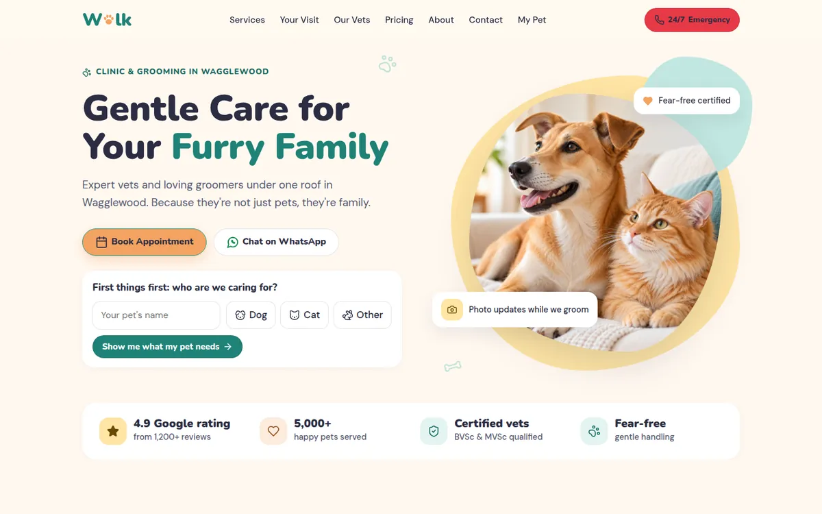
In the first few seconds a visitor decides whether to stay. The hero has to answer three things without any scrolling: what is this, is it for me, and what do I do next?
- The headline is a promise about feeling: “Gentle Care for Your Furry Family”. Not “Best Veterinary Services”. Gentle is the word an anxious parent is looking for.
- Two buttons, one primary. “Book Appointment” is a filled peach button; “Chat on WhatsApp” is the quieter second option for people not ready to commit.
- Proof is right underneath: rating, number of pets cared for, qualified vets and fear-free handling. Visitors see it before they have to wonder.
- Two floating badges on the photo, “Fear-free certified” and “Photo updates while we groom”, answer the two biggest emotional objections before they’re even raised.
- The emergency button is always red and always in the header, so the emergency visitor never has to search.
The colours were chosen deliberately: a calm teal for trust and cleanliness, warm peach and butter-yellow for friendliness, and rounded shapes everywhere. There are no sharp corners on Wolk.
For the clinic: fewer visitors bounce in the first few seconds, and the ones who are ready can book straight from the top of the page.
Step 03
Ask for the pet’s name, then use it everywhere
This is the feature people remember. Under the hero buttons there’s a small card: “First things first: who are we caring for?” It asks for the pet’s name and whether it’s a dog, cat or other. Then it asks the age, and suggests a short care plan.
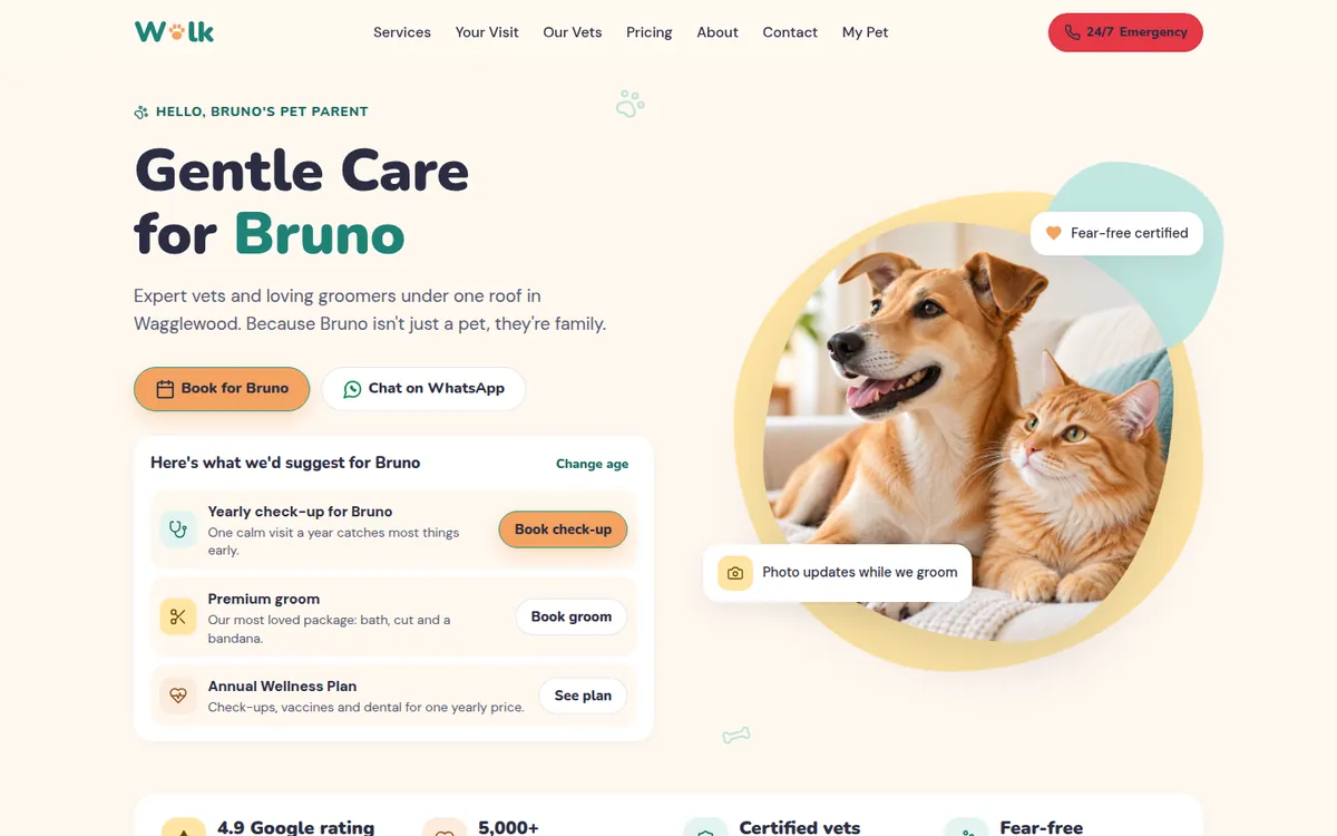
Once the name is in, the entire site starts talking about that pet. Section headings change (“What does Bruno need today?”, “The hands that will hold Bruno”), buttons change (“Book for Bruno”), and the booking form arrives already filled in. It’s stored only in the visitor’s own browser, with no account and nothing sent anywhere.
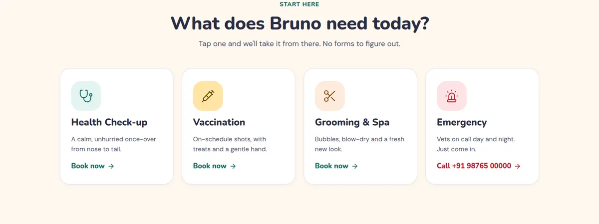
For the clinic: a visitor who has typed their pet’s name is far more engaged than one who is just scrolling, and the booking form starts half-complete, which removes typing at the point where people usually give up.
Step 04
Name the worry before it becomes a reason to leave
Right after the hero comes a section called “What’s on your mind about Bruno’s visit?”. It lists the four worries from step 1 as buttons: they get scared, cost, leaving them alone, cleanliness. Tap one and someone from the team answers it in two or three plain sentences: a vet or groomer with their photo, or the front desk for the cost question.
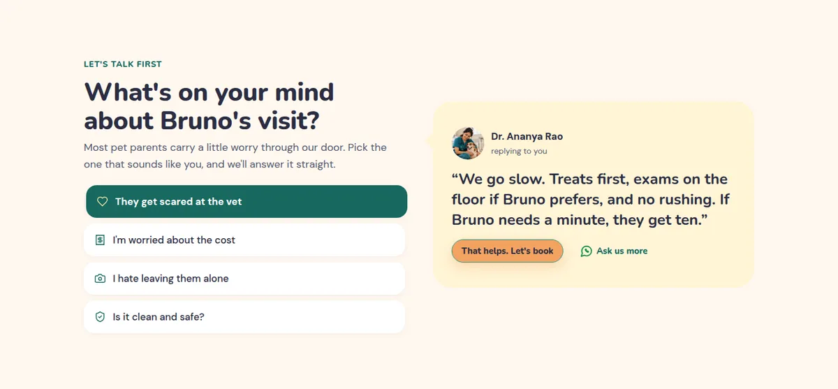
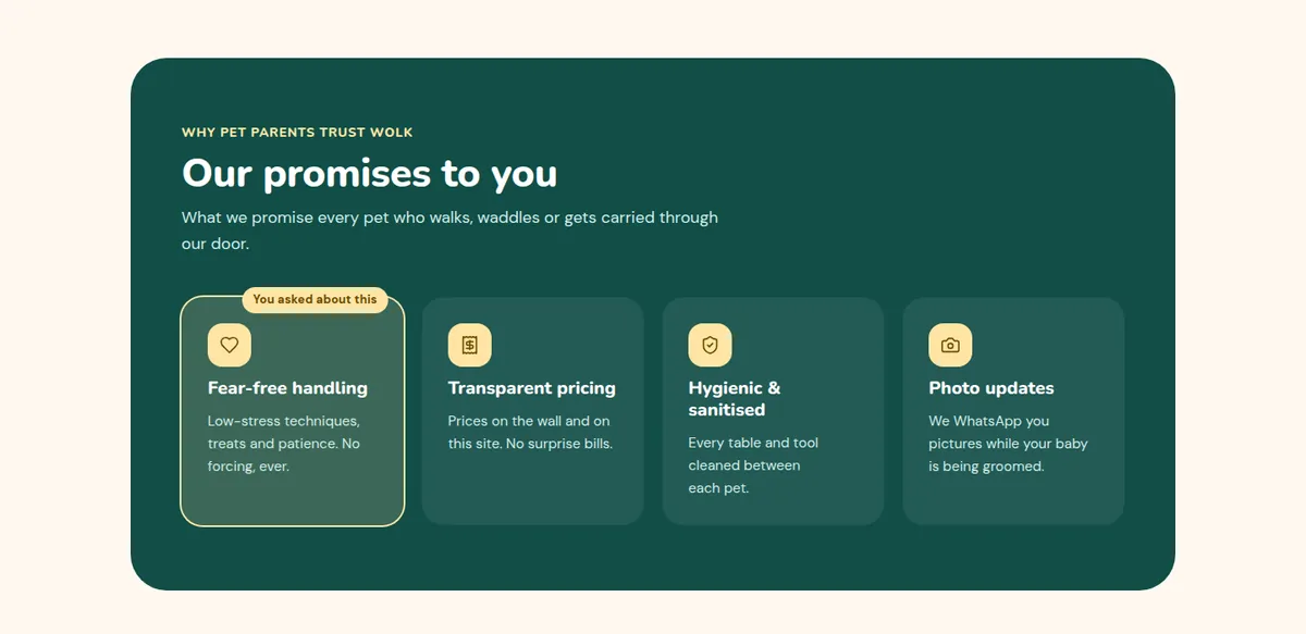
This section does two jobs. It handles objections head-on instead of hiding them in an FAQ at the bottom, and it remembers which worry you chose. Further down, in the “Our promises” section, the matching promise gets a small tag that reads “You asked about this”.
Step 05
Four doors instead of forty links
Once the worry is handled, the visitor needs a direction. The “What does Bruno need today?” section offers exactly four tiles: Health check-up, Vaccination, Grooming & Spa, Emergency. Each goes straight to the right place, and Emergency is coloured differently and shows the phone number instead of a booking link.
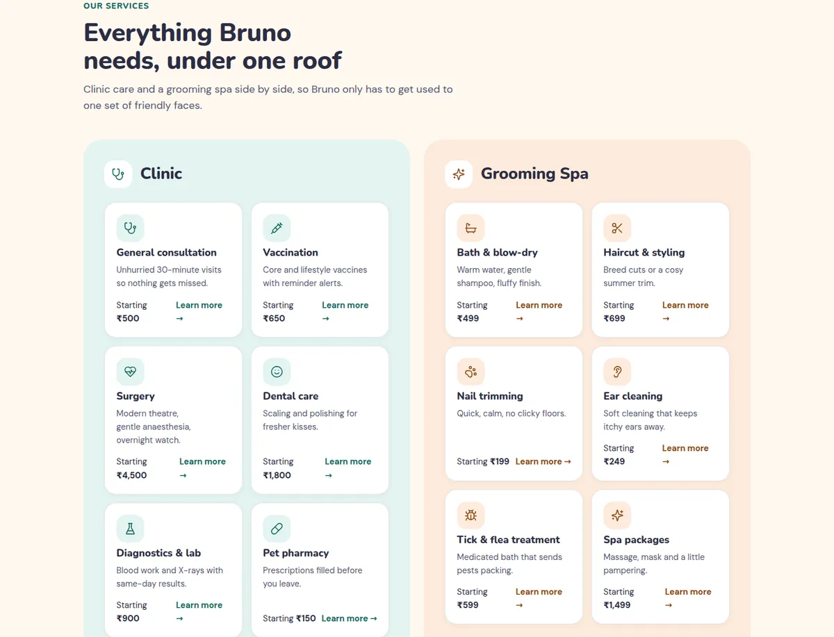
Below that, the full services list is split into just two groups, Clinic and Grooming Spa, side by side, each with a “Starting ₹…” price.
Step 06
Show the result: the before-and-after slider
For grooming, nothing sells like the result. The makeover section has a draggable before-and-after slider with three real-looking makeovers (Coco, Simba, Mishti) and a heading that does something subtle: “Imagine Bruno after a spa day”.
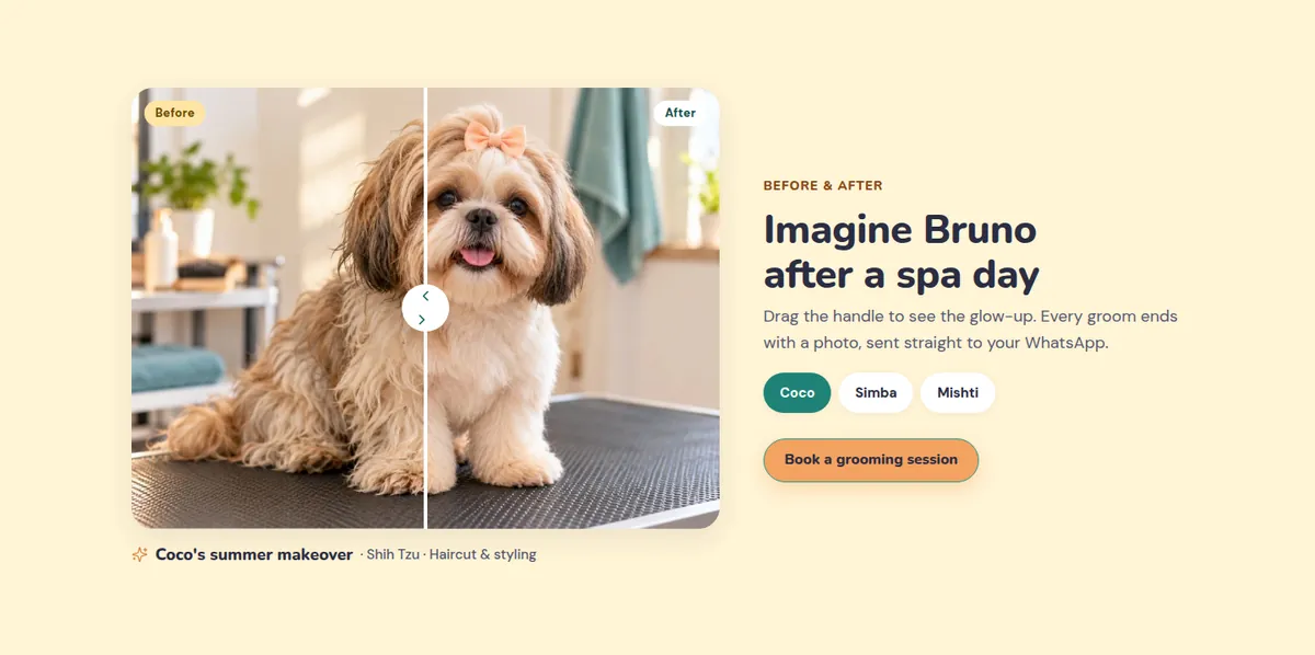
The caption under it says every groom ends with a photo sent to your WhatsApp, which answers a quiet fear: what is happening to my pet while I’m not there?
Step 07
Put faces on the people who will hold the pet
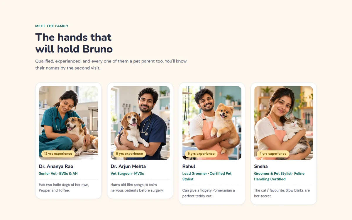
The team section is titled “The hands that will hold Bruno”. Each card has a warm photo of the person with an animal, their qualification, years of experience and one human detail: Dr. Ananya has two indie dogs, Pepper and Toffee; Dr. Arjun hums old film songs to calm nervous patients; Sneha is “the cats’ favourite”.
Step 08
Prices on the page, with a middle option that feels right
Most clinics hide prices because they’re afraid of looking expensive. But for a visitor, an unknown price is scarier than a high one. Wolk puts every starting price on the site and lays out grooming as three packages.
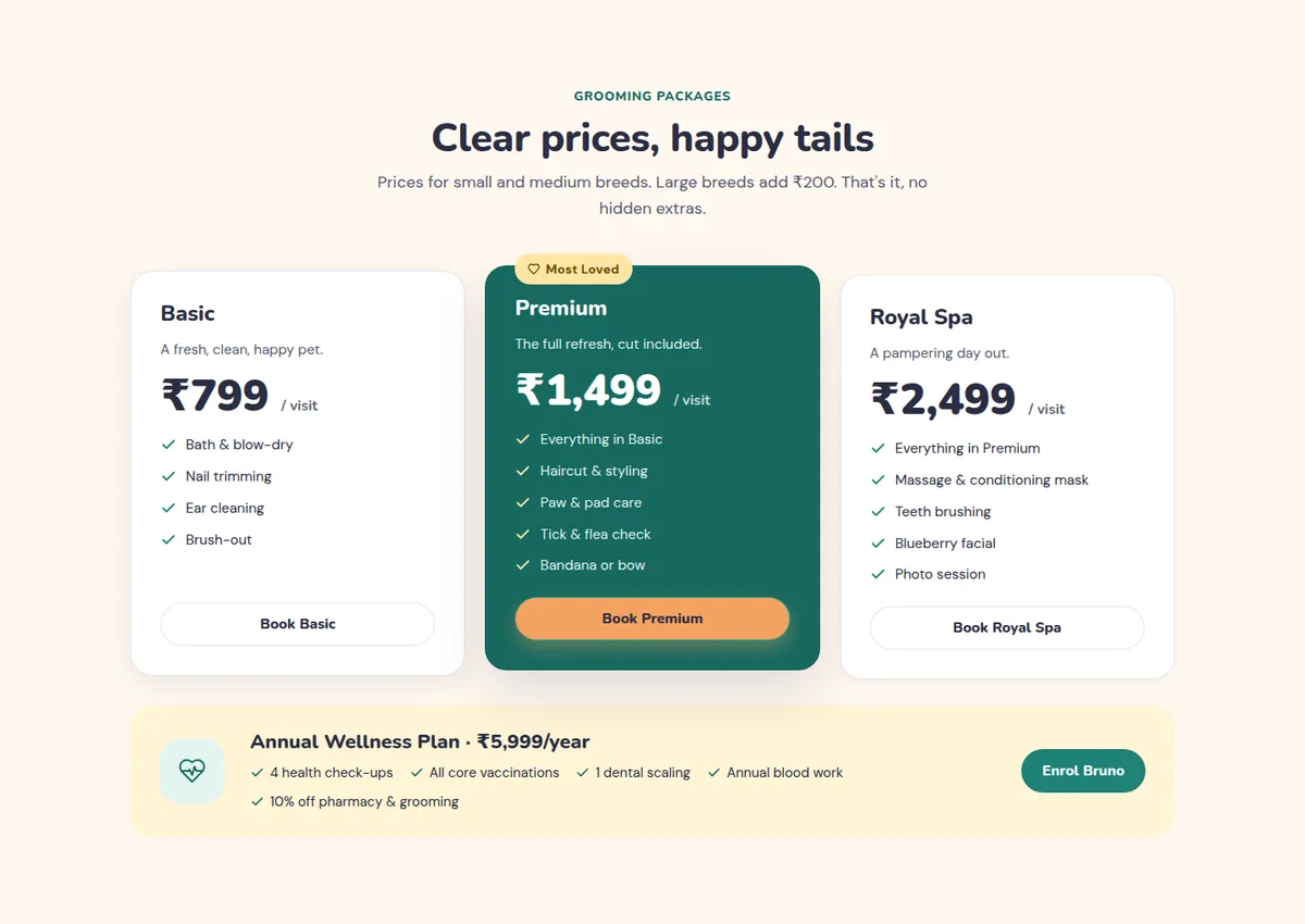
- Basic ₹799 sets a low entry point.
- Premium ₹1,499 is highlighted in teal with a “Most Loved” badge. This is the one most people should buy.
- Royal Spa ₹2,499 is the indulgent option. Few will choose it, but it makes Premium look sensible.
- One line kills the fear of hidden extras: “Large breeds add ₹200. That’s it, no hidden extras.”
- Underneath, an Annual Wellness Plan bundles check-ups, vaccines, dental and blood work for one yearly price.
For the clinic: visitors self-select into a package before they call, so fewer phone calls are “how much is it?”, and the most common choice is the profitable middle one.
Step 09
Social proof from people who felt the same
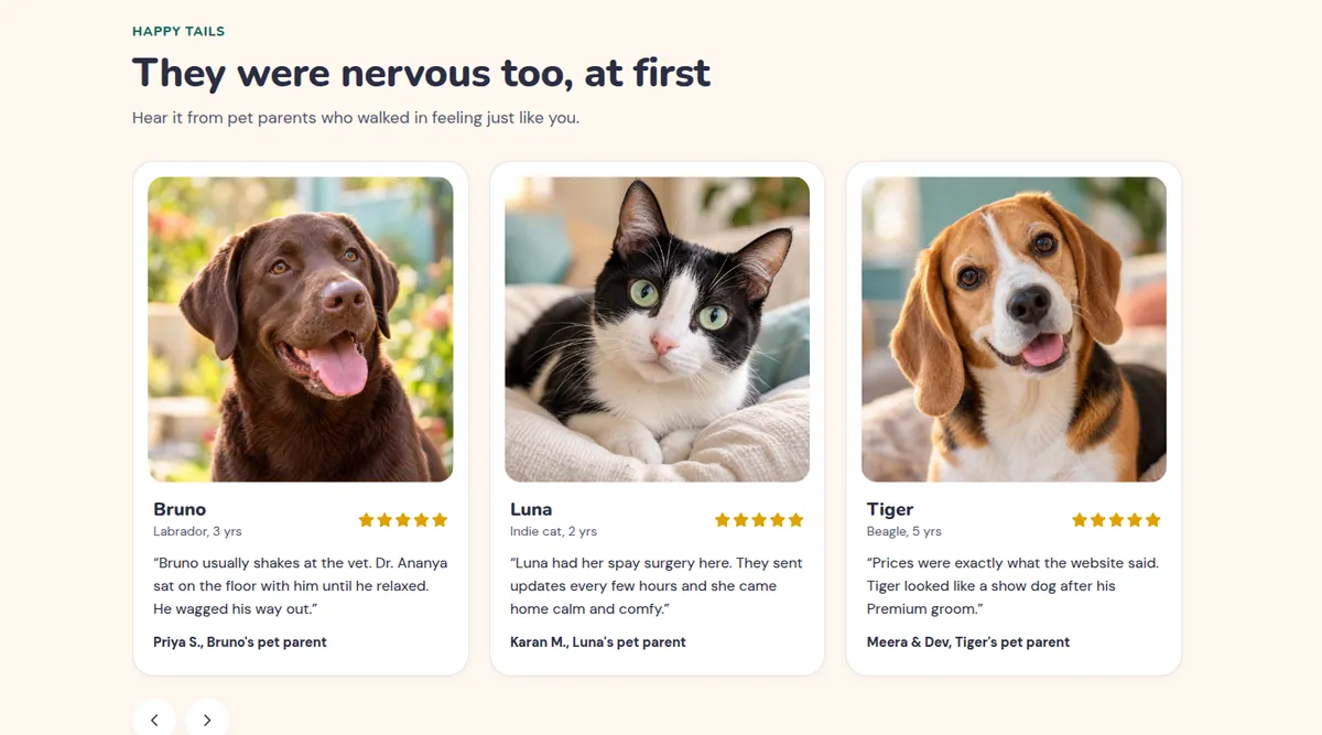
The reviews section is titled “They were nervous too, at first”. Each review starts from a fear and ends with relief: a Labrador who usually shakes at the vet, a cat’s surgery with updates every few hours, a family surprised that the price matched the website.
Step 10
A booking flow that feels like a conversation
Booking is four short screens: your pet → service → date & time → your details. A progress bar at the top shows where you are. Each screen asks for one or two small things, in plain language: “Who are we meeting?”, “What does Bruno need?”, “When suits Bruno?”.
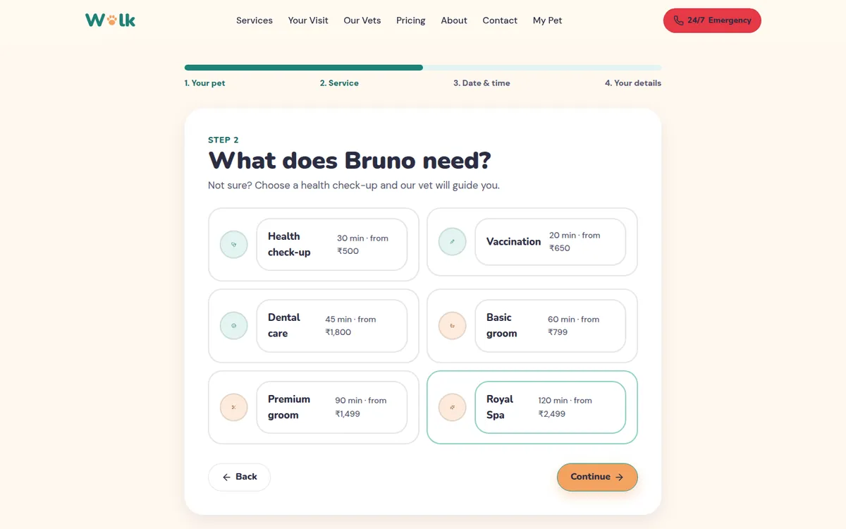
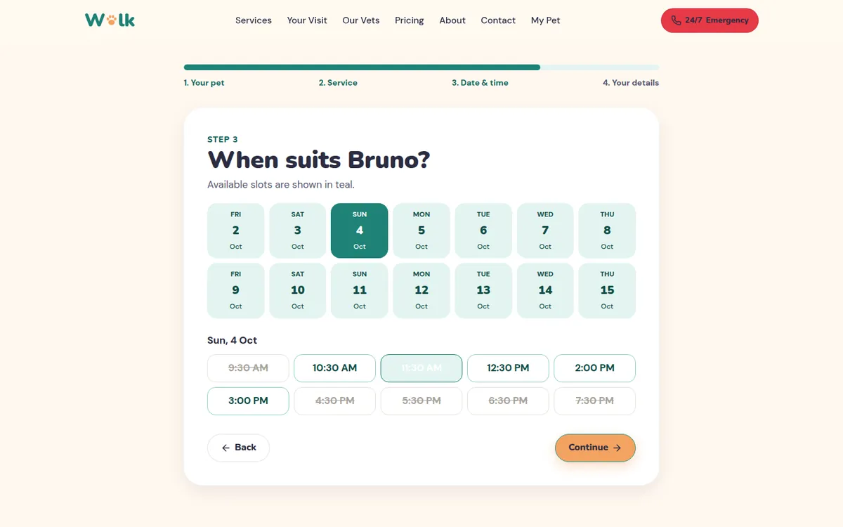
- The pet’s name and type are already filled in from the hero card.
- Every service shows its duration and starting price before you pick it.
- Unavailable times are shown, not hidden. It’s honest, and seeing that others are booking is mild, genuine social proof.
- At the end the booking also appears in the pet’s profile, so it feels saved and real.
Step 11
Remove the fear of the unknown: the visit page
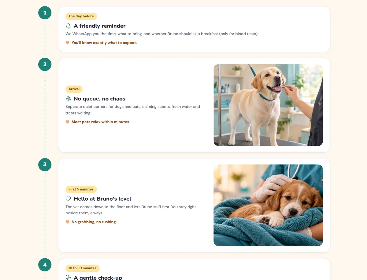
There’s a dedicated “Your Visit” page with the line “The scary part is not knowing what happens.” It walks through a visit minute by minute: the reminder the day before, arrival, the first five minutes on the floor at the pet’s level, the check-up, going home with a WhatsApp summary. There’s a second tab for a grooming day.
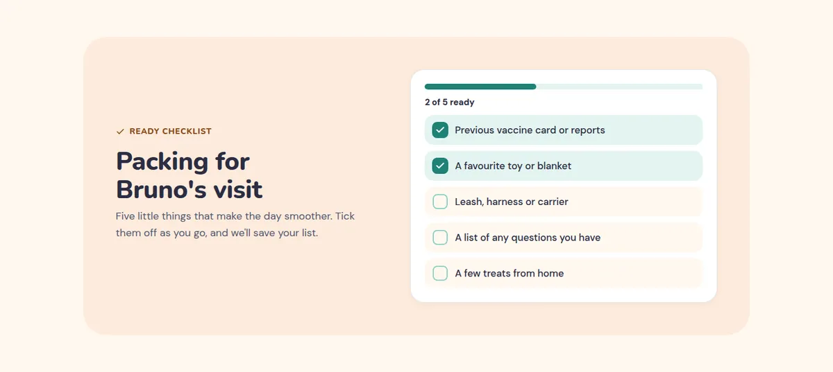
Below it is a packing checklist with five items to tick off (vaccine card, favourite toy, leash, questions, treats) and a progress bar. Ticked items are remembered on the visitor’s device.
Step 12
Give them a reason to come back
A clinic’s best customer is a returning one. Wolk has two features built for that.
“My Pet” profile. A page with the pet’s details, vaccination history with “Due soon” tags, upcoming appointments and a grooming history with photos.
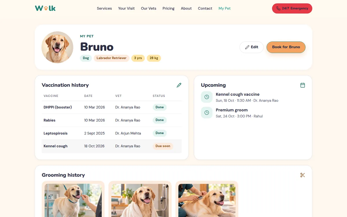
Free WhatsApp reminders. A small form, “Never miss Bruno’s vaccine”, sends a gentle WhatsApp nudge a week before each shot is due, “and nothing else”.
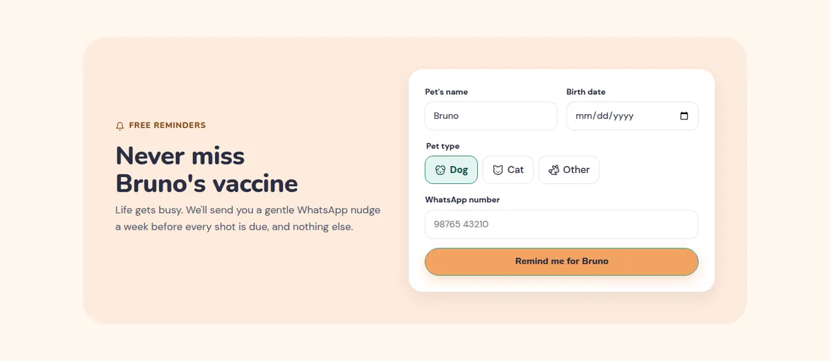
For the clinic: reminders turn one-time visitors into scheduled repeat visits, the cheapest revenue a clinic can get.
Step 13
Built for thumbs: the phone layout
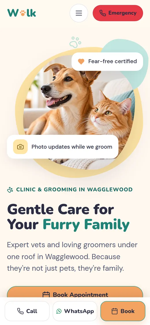
Most pet parents will open this on a phone, often in a hurry. On small screens the photo moves to the top, the layout becomes one column, and a fixed bar at the bottom keeps three actions under the thumb at all times: Call, WhatsApp, Book.
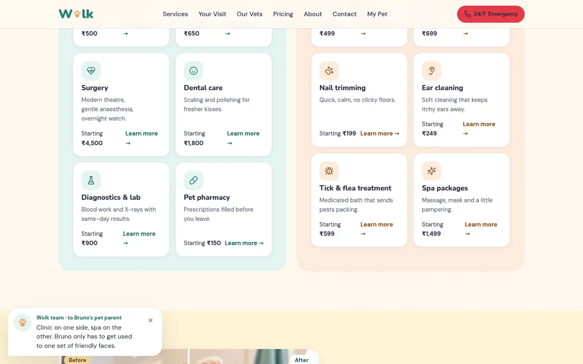
There’s also a small touch I’m fond of: as you scroll, a friendly note from “the Wolk team” appears in the corner with a line that fits the section you’re reading, using your pet’s name. It can be closed with one tap and stays closed for the rest of the visit.
Step 14
The build: tech, speed and search
Wolk is a single-page React app with hash routes for Home, Book, My Pet, About, Your Visit and Contact. It uses a small design system (colour tokens, rounded components, one icon set drawn in code) so every screen looks related.
- No account, no database for the visitor. The pet’s name, profile, checklist and bookings are stored in the browser’s own storage. Nothing personal leaves the device in the demo.
- WhatsApp links are pre-written (“Hi Wolk! I’d like to book a visit for my pet.”), so starting a chat is one tap.
- Accessibility: a skip link, proper labels on every input, keyboard focus styles, and animations switched off for people who ask their device to reduce motion.
- Find us shows a live open/closed status, hours, parking and a simple map.
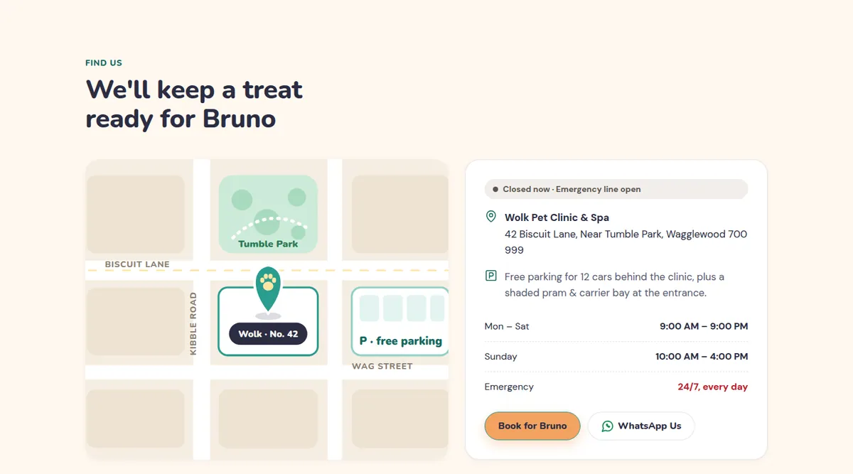
For a live clinic, I’d add: pre-compiled code for a faster first load (the demo compiles in the browser), a page per service so each one can rank in search (“dog grooming near me”, “puppy vaccination schedule”), VeterinaryCare structured data with the address, hours and phone, a properly set-up Google Business Profile with the same details, and analytics events on every booking step so we can see exactly where people drop off.
The Pet care tips section is there on purpose. On a live site each card opens a full article, and topics like “Vaccination schedule for puppies” and “Summer care for dogs in India” answer the questions people actually type into Google, bringing new visitors in for free.
Step 15
How this brings in more pet parents
A website brings in business in two ways: it gets found by more people, and it turns more of those people into bookings. Wolk is designed for both.
More people find it
- Service pages and tips articles match real searches, so the clinic shows up for more questions, not just its own name.
- Real reviews on the site and on Google strengthen local search visibility and click-through.
- WhatsApp sharing: a groom photo sent to the parent’s phone is the kind of thing that gets forwarded to family. Word of mouth with a picture attached.
More of them book
- Worries are answered on the page, so fewer people leave to “think about it”.
- Prices are visible, so the people who call are already ready to book.
- The pet’s name and pre-filled forms make booking feel personal and quick.
- Reminders and the pet profile turn first visits into repeat visits.
I don’t promise numbers for a demo, and I’d be suspicious of anyone who did. What I do on a live project is measure: the Google tag tracks each step of the booking flow, and we adjust the step where most people stop.
At a glance
The psychology at a glance
Every principle used on the site, where it shows up, and what it does for the visitor.
| Principle | Where it’s used | What it does |
|---|---|---|
| Identity language | “Pet parent”, “your baby” | Feels like they understand you |
| Visual hierarchy | One primary button, one soft one | Next step is obvious |
| Curved shapes | Rounded cards, buttons and photos | Feels gentle and safe |
| Cocktail-party effect | Pet’s name in headings and buttons | Grabs attention, feels personal |
| Foot-in-the-door | Name first, then age, then booking | Small yes leads to the next |
| Affect labelling | Tap the worry you have | Naming a fear shrinks it |
| Hick’s law | Four “what do you need” tiles | Faster decisions |
| Mental imagery | “Imagine Bruno after a spa day” | Desire for the outcome |
| Warmth + competence | Credentials and one personal story per person | Trust in the people |
| Compromise effect | Three packages, middle highlighted | Most choose the middle |
| Similar social proof | “They were nervous too, at first” | Proof from people like me |
| Goal-gradient | Progress bar in booking | Fewer people quit midway |
| Zeigarnik effect | Packing checklist, “2 of 5 ready” | Pulls people back |
| Reciprocity | Free WhatsApp vaccine reminders | Goodwill and repeat visits |
| Fitts’s law | Bottom bar: Call, WhatsApp, Book | Effortless on a phone |
Your turn
Steal this for your own website
You don’t need a new website to use these. Most can be applied to the one you have this week.
- Write down your visitor’s four biggest worries in their words, and answer each one on the homepage.
- Ask for one small, friendly piece of information (a name) and use it to personalise what follows.
- Put prices on the site. Offer three options and highlight the one most people should pick.
- Keep booking to one or two fields per screen, with a progress bar and anything you already know pre-filled.
- Show what happens during a visit, step by step. Uncertainty is what makes people put it off.
- Make Call, WhatsApp and Book reachable with a thumb on every phone screen.
- Use only real reviews, and choose ones that start with the same fear your visitors have.
Questions
Questions people ask
How much does a pet clinic website like this cost?
It depends on scope: a marketing site with booking requests is very different from one connected to a clinic’s appointment system. Send me what you need and I’ll give you a fixed quote before any work starts.
Can the booking connect to our existing appointment software?
Usually, yes. If your software has an API or calendar sync, bookings can go straight in. If not, they can arrive on WhatsApp or email in a fixed format your front desk can enter quickly.
Do I need an app, or is a website enough?
For most clinics a fast, mobile-first website with WhatsApp reminders does the job. A dedicated app makes sense once you have many repeat clients who want records, reminders and payments in one place.
Is storing the pet’s name in the browser safe?
In the demo, the name and checklist stay on the visitor’s own device and are never sent anywhere. On a live site, anything that needs to reach the clinic (like a booking) is sent only when the visitor submits it.
Will this help my clinic rank on Google?
The structure helps: service pages, helpful articles, fast pages and correct local business details. Ranking also depends on your Google Business Profile, real reviews and competition in your area, so I set those up together.
Further reading
Sources and further reading
The principles above come from published research and long-standing practice in psychology and usability. If you want to read further:
- Bar, M. & Neta, M. (2006). Humans prefer curved visual objects. Psychological Science.
- Moray, N. (1959). Attention in dichotic listening: affective cues and the influence of instructions. Quarterly Journal of Experimental Psychology.
- Freedman, J. L. & Fraser, S. C. (1966). Compliance without pressure: the foot-in-the-door technique. Journal of Personality and Social Psychology.
- Lieberman, M. D. et al. (2007). Putting feelings into words: affect labeling disrupts amygdala activity in response to affective stimuli. Psychological Science.
- Fiske, S. T., Cuddy, A. J. C. & Glick, P. (2007). Universal dimensions of social cognition: warmth and competence. Trends in Cognitive Sciences.
- Simonson, I. (1989). Choice based on reasons: the case of attraction and compromise effects. Journal of Consumer Research.
- Prelec, D. & Loewenstein, G. (1998). The red and the black: mental accounting of savings and debt. Marketing Science.
- Kivetz, R., Urminsky, O. & Zheng, Y. (2006). The goal-gradient hypothesis resurrected. Journal of Marketing Research.
- Cialdini, R. B. Influence: The Psychology of Persuasion.
- Hick, W. E. (1952). On the rate of gain of information. Quarterly Journal of Experimental Psychology.
- Fitts, P. M. (1954). The information capacity of the human motor system in controlling the amplitude of movement. Journal of Experimental Psychology.