Case study · Ecommerce store + mobile app
A toy shop where youcan drive the trainbefore you buy it.
Junction is a wooden toy store, with a matching iPhone and Android app, that I designed and built as a demo. This post walks through it step by step: what I built, why, and the human psychology that turns a browsing parent into a happy order.
In one minute
- A live 3D train on the homepage and product page: drag, toot, ride along.
- The headline reframes a premium price as a toy that lasts a generation.
- Shopping is organised by how children play, with filters by age and budget.
- Reassurance sits right under the Add to bag button, where doubt peaks.
- The bag shows how close you are to free shipping; checkout is one page.
Who this is for
Ecommerce brands selling premium or giftable products: toys, furniture, crafts, homeware, jewellery. Anyone whose price needs explaining.
Every idea here works on an existing site too. There’s a checklist at the end.
Jump to the checklistOn this page
- Who buys wooden toys, and what stops them
- Two promises before the first scroll
- A headline that reframes the price
- Let them play: the live 3D train
- Shop by play, not by SKU
- A system, not a product: the railway standard
- Three promises that answer the scariest questions
- The product page: reassurance at the moment of doubt
- The bag: a nudge toward free shipping
- Checkout on one page
- The workshop story: effort you can see
- A newsletter that promises less
- The mobile app prototype
- Build notes: 3D without the weight, and search
- How this sells more toys
- The psychology at a glance
- Steal this for your own website
- Questions people ask
- Sources and further reading
Premium wooden toys have an awkward problem online. A $89 train looks like a $15 plastic one in a photo, so the price needs justifying. Parents worry about safety (it will go in the mouth). Grandparents buying gifts don’t know what suits a three-year-old. And everyone hesitates at the last step because they can’t hold the thing in their hands.
Junction is built to answer all of that, using the same idea throughout: let people experience the toy, then remove every reason to hesitate at the moment it appears.
Here is how it’s built, step by step, with the psychology behind each choice.
Junction is a design demo of a fictional shop. Products, prices and policies are placeholders, and the product photos come from a stock library. A real shop gets its own photography and its real policies before launch.
Step 01
Who buys wooden toys, and what stops them
I started by writing down the two main buyers and what holds each of them back:
- Parents want something safe, durable and screen-free. Their doubts: is it safe to chew? Will it break in a week? Is it worth three times the price of plastic?
- Gift buyers (grandparents, aunts and uncles, friends) want a present that lands well. Their doubts: what suits this age? Will it arrive in time? Can it be returned if they already have one?
Every section of the store answers one of those doubts. The rest of this post follows them in the order a shopper meets them.
Step 02
Two promises before the first scroll
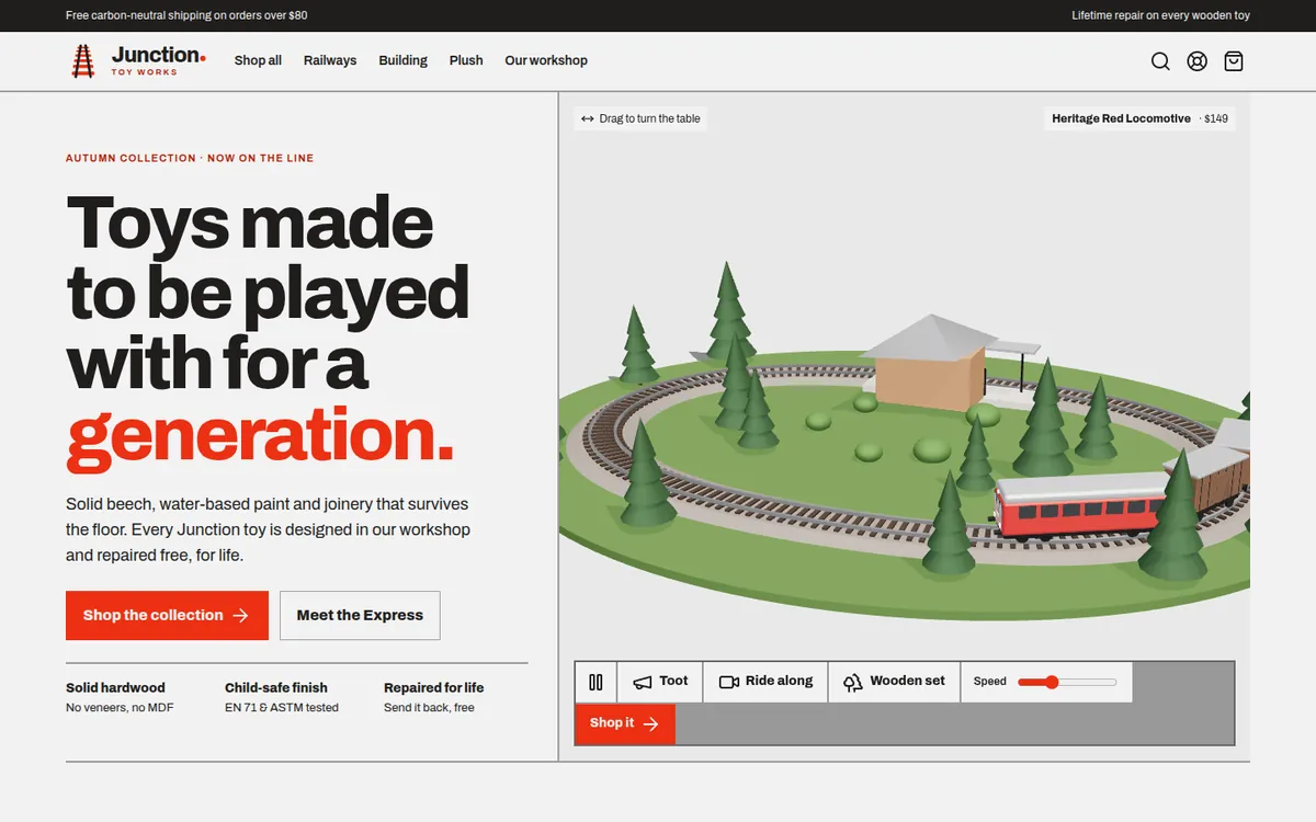
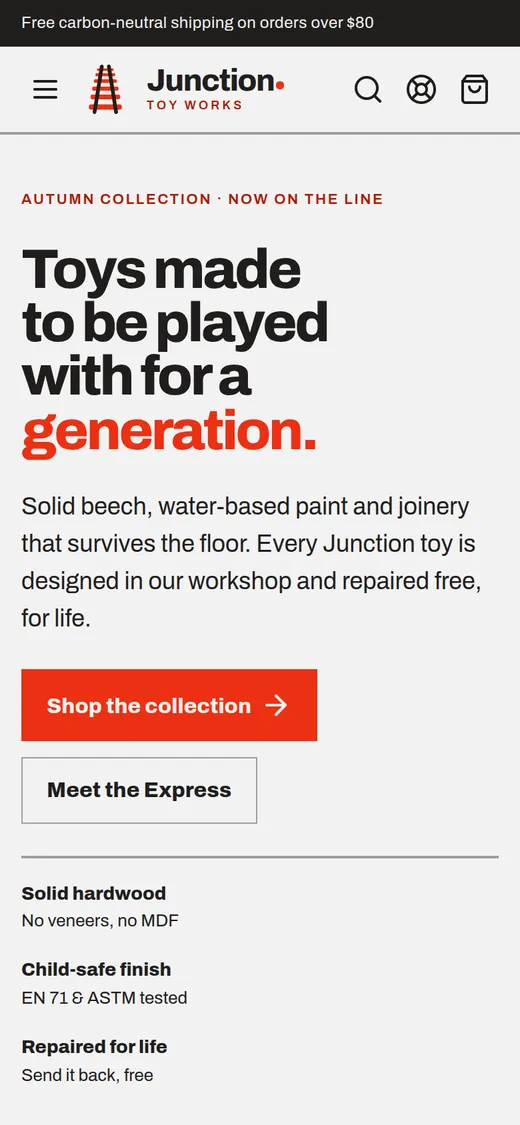
Above the navigation, a slim dark bar carries the shop’s two strongest promises on every page: “Free carbon-neutral shipping on orders over $80” and “Lifetime repair on every wooden toy”.
They’re there before the visitor even sees a product, so the first impression is not “expensive”, it’s “safe to buy from”.
Step 03
A headline that reframes the price
The headline is “Toys made to be played with for a generation.” The last word is in red. Under it: solid beech, water-based paint, “joinery that survives the floor”, and “repaired free, for life”. Below that, three short proof points line up the main objections and knock them down:
- Solid hardwood — no veneers, no MDF
- Child-safe finish — EN 71 & ASTM tested
- Repaired for life — send it back, free
Step 04
Let them play: the live 3D train
The right half of the homepage is a live 3D wooden train set, built with three.js. You can drag to turn the table, press Toot to sound the horn, switch to Ride along to see the track from the engine, swap between the wooden set and the Heritage red locomotive, change the speed, and jump straight to the product with Shop it.
This is the feature that makes people stay. Parents call their kids over to watch, and it photographs well when shared. It also does real selling work: you can see how the wagons couple, how big the station is next to the engine, and how the track loops.
For the shop: visitors spend longer on the page, understand the product better (fewer “not what I expected” returns), and have a reason to share the link.
Step 05
Shop by play, not by SKU
The first section below the hero is “Six ways to spend an afternoon”: Railways, Building, Plush, Learning, Vehicles, Animals. Each tile says what the play is (“Engines, wagons & track that click together”, “Blocks cut to one true module”) and how many toys are in it.
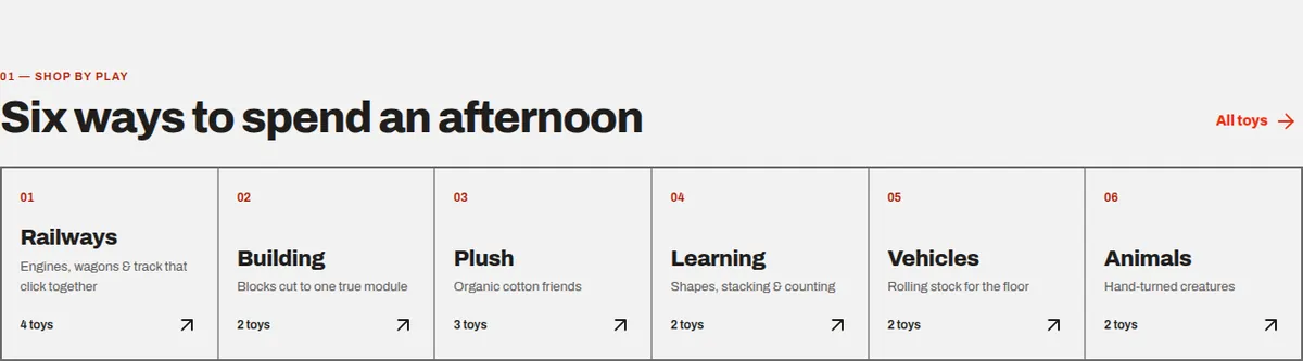
In the full shop, filters match how gift buyers think: age (0–1, 2–3, 4+) and budget (under $40, $40–$80, over $80), alongside category and sort.
Step 06
A system, not a product: the railway standard
The railway section is called “One track standard since day one.” Every engine, wagon and bridge Junction has ever made fits every other. The copy spells out what that means for a family: “Start with an engine this year, add a bridge next birthday — the layout grows with the child.” A small spec table (gauge, couplings, axles, finish) backs it up.
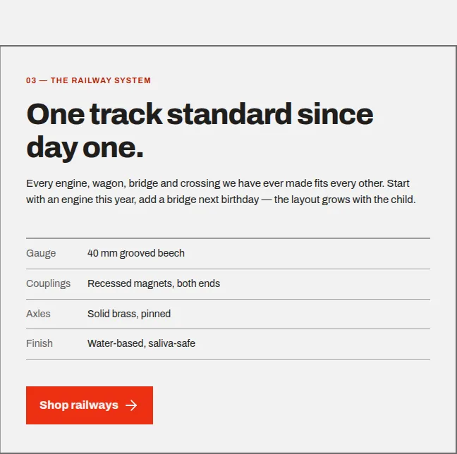
For the shop: each first purchase seeds the next one. Repeat gifts to the same child are the cheapest customers a toy brand can get.
Step 07
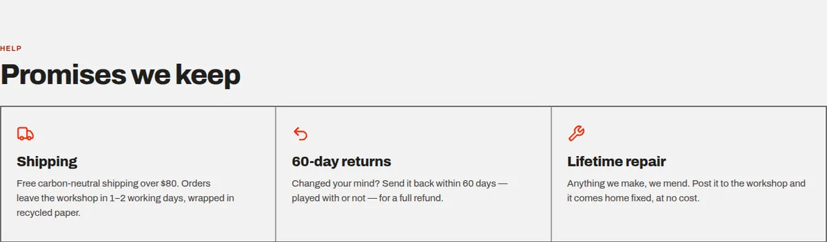
Three promises that answer the scariest questions
Below the railway section, three short promises answer the doubts every parent has, in words that are almost blunt:

Step 08
The product page: reassurance at the moment of doubt
The product page is where people decide, and where doubt peaks. Junction’s product page is laid out so the answers sit exactly where the doubt appears:
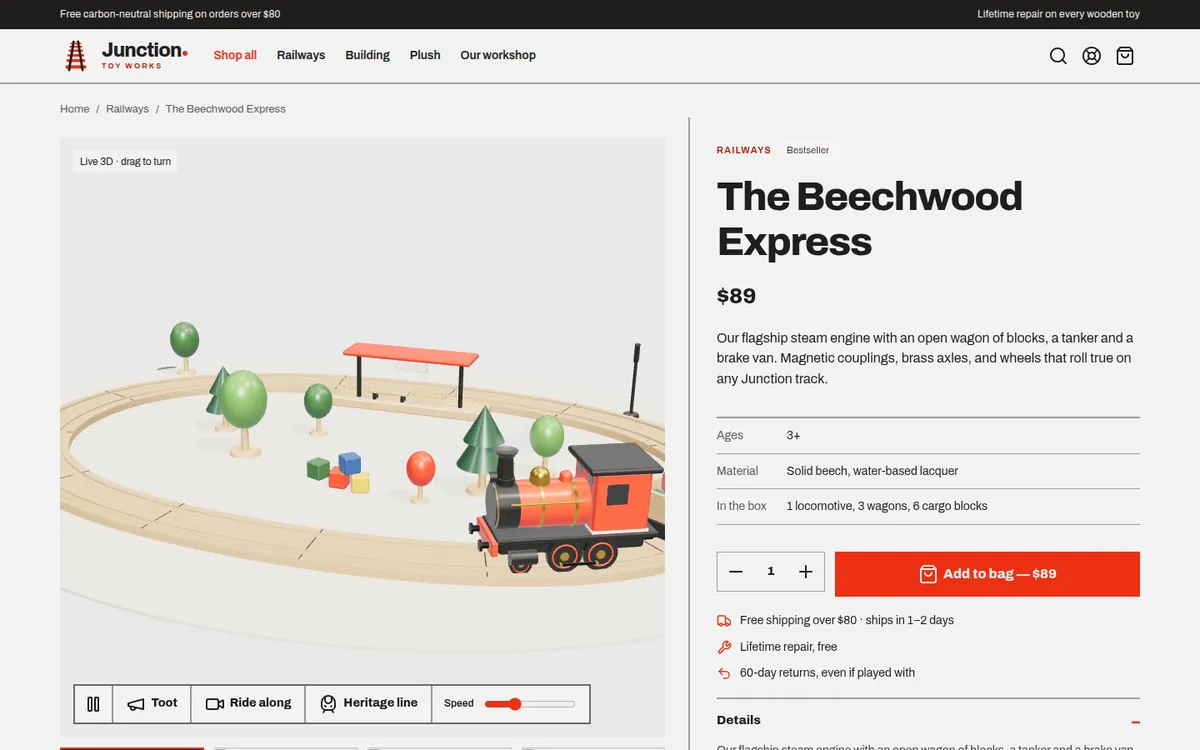
- For trains and railway sets, the live 3D scene on the left; other toys show photos.
- A short description, then a tidy table: ages, material and what’s in the box (“1 locomotive, 3 wagons, 6 cargo blocks”).
- The button says “Add to bag — $89”. The price is in the button, so there’s no surprise.
- Directly under the button: free shipping over $80 · ships in 1–2 days, lifetime repair, free, and 60-day returns, even if played with.
- Further down, “Complete the set” suggests matching track and accessories.
Step 09
The bag: a nudge toward free shipping
In the bag, the summary shows a progress bar towards free shipping: “You are $22 away from free shipping.” Once you pass $80 it turns into “Free shipping unlocked”. Gift wrap is free and listed as a line item, and returns and recycled wrapping are repeated under the checkout button.
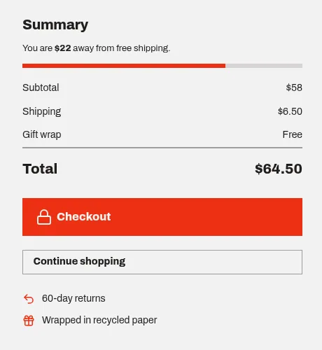
An empty bag isn’t a dead end either. It says “The next favourite toy is one click away”, followed by a row of small, lower-priced toys under the heading “Small things, big afternoons”.
For the shop: a higher average order value, because the cheapest way to free shipping is one more small toy.
Step 10
Checkout on one page
Checkout is a single page with numbered sections (contact, delivery address, shipping, payment) and the order summary always visible on the right. There’s an optional gift message field (the placeholder says “Happy birthday, little conductor!”), and the button shows the exact total: “Place order — $221”.
Step 11
The workshop story: effort you can see
The Our workshop page tells the founding story in two sentences: one wooden engine made for a nephew who wore the paint off in a month. Then it shows “Four steps, no shortcuts”: air-dried timber, cut to a 4 cm module, finished by hand with three coats, then pull, drop and bite tested to EN 71 and ASTM F963.
Step 12
A newsletter that promises less
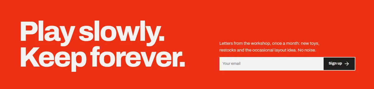
The newsletter sign-up is a big red band: “Play slowly. Keep forever.” The promise is modest: “Letters from the workshop, once a month: new toys, restocks and the occasional layout idea. No noise.”
Step 13
The mobile app prototype
Alongside the store there’s a clickable app prototype shown side by side in an iPhone and an Android frame. It reuses the same products and data, with a home screen, shop, gifts, bag and account tabs.
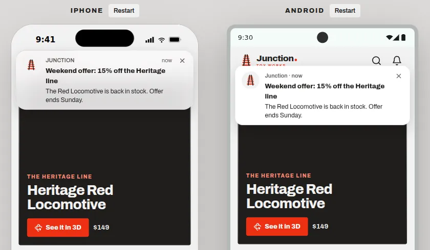
- Push notifications with a real reason: “The Red Locomotive is back in stock. Offer ends Sunday.”
- “Find a gift by age — three taps to the right toy”, a guided finder for gift buyers.
- “See it in 3D” on the featured product, the same interactive model as the website.
- A bag badge on the tab bar that keeps the order in view.
Step 14
Build notes: 3D without the weight, and search
The store is six static HTML pages (home, shop, product, bag, checkout, workshop) with one shared JavaScript file for products, the bag and filters. The bag is saved in the browser, so it survives a refresh. The 3D scene uses three.js, loaded as a module after the page content, so the headline and buttons appear first and the train arrives a moment later.
- Fonts are self-hosted, so text renders quickly without waiting on a third party.
- Every product has its own URL (
product.html?id=…) for sharing. For a live shop I’d move these to clean, keyword-rich paths like/toys/beechwood-express-train/. - For a live shop I’d add:
ProductandOfferstructured data so prices and stock show in Google results, aToyStoreorganisation profile, gift guides by age (“best wooden toys for a 3-year-old”) as articles, real product photography, and analytics on add-to-bag and every checkout step.
Step 15
How this sells more toys
More people find it, and share it
- The 3D train is shareable. It’s the kind of link a parent sends to their partner, or a grandparent sends to the family group.
- Category and age pages match how people search for gifts, and gift guides bring in visitors who haven’t heard of the brand yet.
- Product structured data lets prices and availability appear directly in search results.
More of them buy, and buy again
- The price is reframed by the “for a generation” promise and lifetime repair.
- Safety, delivery and returns are answered at the Add to bag button.
- The free-shipping bar raises the average order; free gift wrap and a gift message serve gift buyers.
- The railway standard turns one purchase into a collection, and the newsletter and app bring buyers back.
As always, I don’t quote results for a demo. On a live shop, analytics on every step of the funnel show where shoppers drop off, and that’s where the next improvement goes.
At a glance
The psychology at a glance
Every principle used on the site, where it shows up, and what it does for the visitor.
| Principle | Where it’s used | What it does |
|---|---|---|
| Risk reversal | Lifetime repair in the top bar | Premium price feels safe |
| Reframing | “Played with for a generation” | Cost per year, not price |
| Mere touch / ownership | Live 3D train you can control | Feels like it’s already yours |
| Mental models | Shop by play, filter by age and budget | Faster gift finding |
| Collection mindset | One track standard since day one | Repeat purchases |
| Processing fluency | “Safe to chew” | Plain words believed |
| Anticipated regret | Shipping, repair and returns under the button | Fewer abandoned carts |
| Goal-gradient | “$22 away from free shipping” bar | Bigger orders |
| Visible generosity | “Gift wrap: Free” as a line item | Goodwill |
| Effort heuristic | Air-dried timber, three coats, tested | Quality justifies price |
| Lower commitment cost | Newsletter: “once a month, no noise” | More sign-ups |
| Honest scarcity | Back-in-stock alert, offer ends Sunday | Action without distrust |
| Hick’s law | Three-tap gift finder | Easier choice |
Your turn
Steal this for your own website
You don’t need a new website to use these. Most can be applied to the one you have this week.
- Write down every doubt your buyers have and answer each one where it appears, especially under the Add to bag button.
- If your price needs explaining, reframe it: cost per year, cost per use, or what it replaces.
- Let people interact with the product: 3D, a configurator, or at least a zoomable gallery.
- Organise the shop around the buyer’s questions (age, budget, occasion), not your catalogue.
- Show progress toward free shipping in the bag, and suggest small items that close the gap.
- Keep checkout on one page with the total in the button.
- Use only real deadlines and real stock alerts.
Questions
Questions people ask
Does 3D slow the website down?
It doesn’t have to. On Junction the 3D scene loads after the page content, so the text and buttons appear first. On a live shop I also compress the models and load the 3D only when it scrolls into view.
Do I need a custom store, or is Shopify enough?
Shopify (or WooCommerce) is the right choice for most shops, and everything in this post, including the 3D viewer and the free-shipping bar, can be built on top of it. A custom store makes sense when you need something those platforms can’t do well.
Can you make 3D models of my products?
Yes, for simple products like toys, furniture or packaging they can be modelled from photos and measurements. For complex products, photogrammetry or a manufacturer’s CAD file is usually the better route.
Is a mobile app worth it for a small shop?
Usually not on day one. A fast mobile website comes first. An app becomes worth it once you have loyal repeat buyers who would value back-in-stock alerts, saved bags and quick reorders.
How do you improve sales after launch?
With analytics on every step: product views, add to bag, checkout start and order. Then we fix the step that loses the most people, test the change, and repeat.
Further reading
Sources and further reading
The principles above come from published research and long-standing practice in psychology and usability. If you want to read further:
- Peck, J. & Shu, S. B. (2009). The effect of mere touch on perceived ownership. Journal of Consumer Research.
- Tversky, A. & Kahneman, D. (1981). The framing of decisions and the psychology of choice. Science.
- Kivetz, R., Urminsky, O. & Zheng, Y. (2006). The goal-gradient hypothesis resurrected. Journal of Marketing Research.
- Kruger, J., Wirtz, D., Van Boven, L. & Altermatt, T. W. (2004). The effort heuristic. Journal of Experimental Social Psychology.
- Reber, R. & Schwarz, N. (1999). Effects of perceptual fluency on judgments of truth. Consciousness and Cognition.
- Cialdini, R. B. Influence: The Psychology of Persuasion.
- Hick, W. E. (1952). On the rate of gain of information. Quarterly Journal of Experimental Psychology.