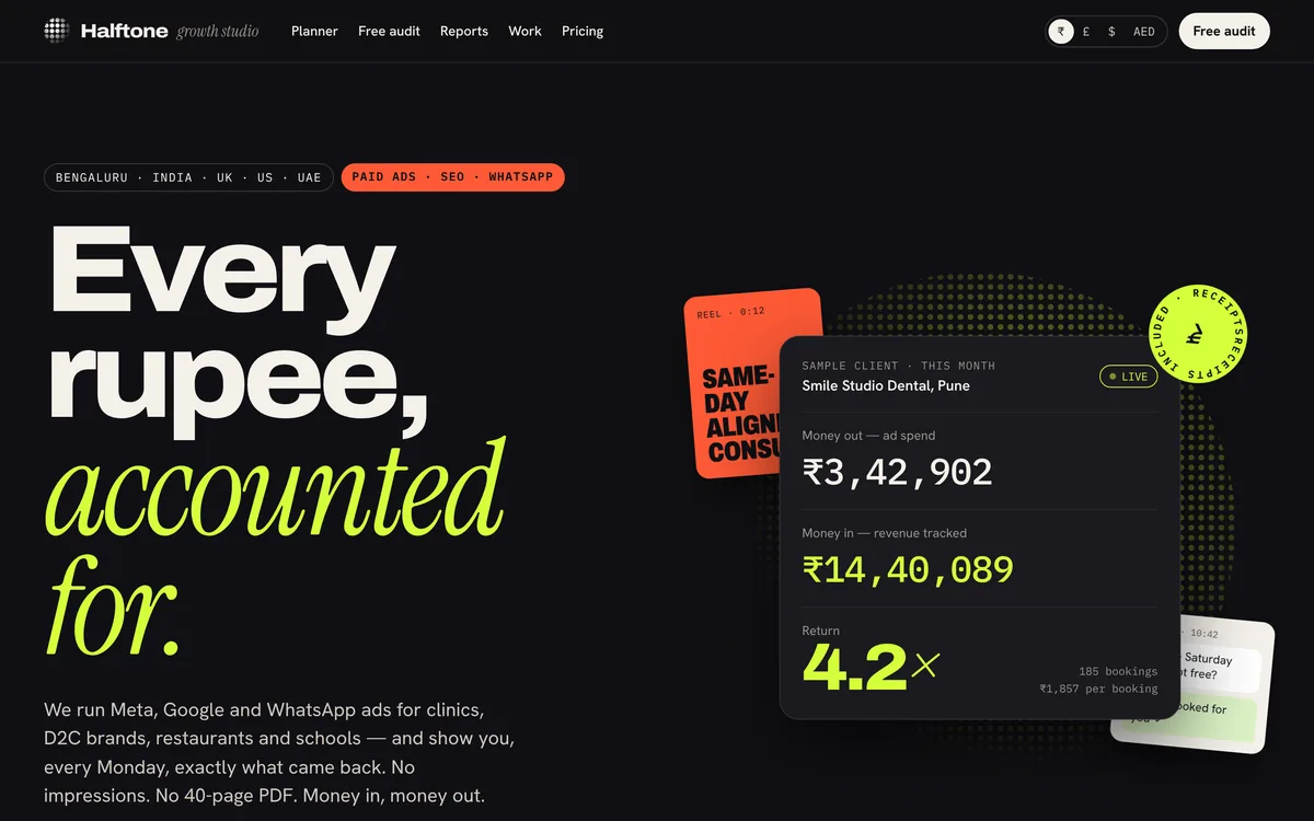
Case study · Influencer website
A creator websitefor brands and fansat the same time
Tara Iyer is a website I designed and built as a demo for a food and travel creator in Mumbai. This is the full walkthrough: what each section does, how brands and fans use it, and the psychology that turns a link in bio into brand deals, sales and newsletter readers.
In one minute
- A creator site has two visitors: brands who pay and fans who make her worth paying. A switch at the top reorders the whole page for each.
- Brands see who actually watches, with a real-audience check, before they see a price.
- A package builder lets a brand put together a deal and see the price and expected views in seconds.
- Past campaigns show results with receipts, including the one that flopped, and the calendar shows real open slots.
- Fans get recipes, city guides, a small shop and a Sunday newsletter, all in Tara’s own voice.
Who this is for
Creators and influencers, talent managers, and anyone whose audience is the product: chefs, travel writers, coaches and artists.
Every idea here works on an existing site too. There’s a checklist at the end.
Jump to the checklistOn this page
- Two visitors, two journeys
- A first screen in her own voice
- One switch that reorders the page
- Who actually watches
- A package builder instead of “DM for rates”
- Brand work, with receipts
- How working together goes, and when
- The content wall
- A small shop, priced like a good thali
- A newsletter she owns
- An enquiry form that’s already filled in
- It works on a phone
- The psychology at a glance
- Steal this for your own creator website
- Questions people ask
A creator with a million followers usually has a link-in-bio page with eight buttons, a media kit PDF that is six months old, and an inbox full of “what are your rates?”. Brands can’t easily check the audience, fans can’t find last week’s recipe, and nothing on the page earns money while she sleeps.
With Tara’s site I set one rule: every visitor should get what they came for in the first scroll, and every claim to a brand should come with a number they can check. Below is each section in the order you meet it, with the screenshot, what it does and the psychology behind it.
Tara Iyer is a design demo. The creator, her audience numbers, rates, brands, campaign results and reviews are fictional placeholders, and for a real creator they are replaced with the real ones before launch. Some screenshots here leave out the food photos, which load from a photo library on the live site. The design decisions and the psychology are what this post is about.
Step 01
Two visitors, two journeys
Most creator websites are a link-in-bio page with a few buttons, or a portfolio aimed only at brands. Both miss the point. A creator’s site has two very different visitors, and each needs a different page:
- A brand manager, who wants to know if the audience is real, if they are the brand’s customers, what a deal costs and whether it has worked before.
- A fan, who wants the recipe from last night’s reel, a guide for their next trip, something to buy and a way to hear more.
The brands pay the bills, but the fans are why the brands pay. So Tara’s site asks one question straight away, “first, who’s visiting?”, and the answer changes the order of everything below it.
For the creator: one website does the job of a media kit, a link-in-bio page and a small online shop, without either audience feeling it was built for someone else.
Step 02
A first screen in her own voice
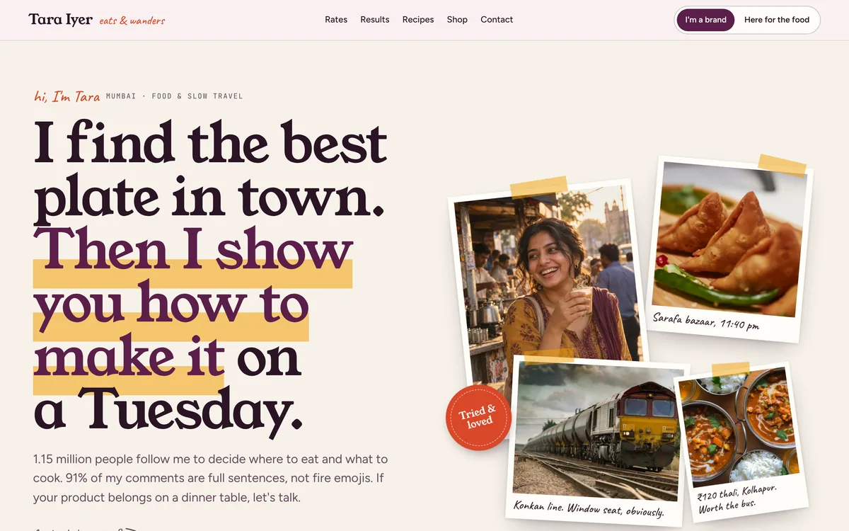
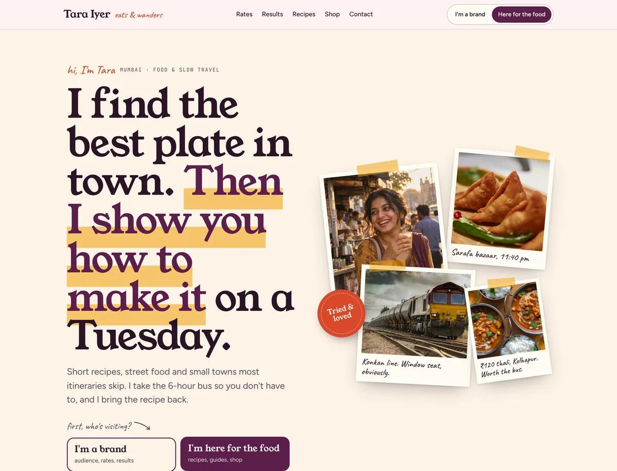
The headline sounds like Tara talking: “I find the best plate in town. Then I show you how to make it on a Tuesday.” The second half is highlighted in saffron, like a marker on a recipe card. Next to it, four photo cards are taped to the page at an angle, each with a handwritten caption: Sarafa bazaar, 11:40 pm, Konkan line. Window seat, obviously, ₹120 thali, Kolhapur. Worth the bus. A red stamp says Tried & loved.
Under the text are two big buttons, I’m a brand and I’m here for the food, and a strip of numbers: 840K on Instagram, 310K on YouTube, 42K newsletter readers, 412K average reel views and a 6.8% engagement rate, updated 1 Oct 2026 from platform insights. A note in the corner says “I screenshot these every month. Ask for them.”
For the creator: the site sounds like the person brands are paying for, which is exactly what they want to see before booking her.
Step 03
One switch that reorders the page
The switch sits in the hero and in the top bar, so it is always one tap away. Choose I’m a brand and the page runs: audience, package builder, brand work, how working together goes, then the content wall and shop. Choose I’m here for the food and the hero text changes to “I take the 6-hour bus so you don’t have to, and I bring the recipe back”, the colours warm slightly, and the page runs: recipes, the shop, the content wall, the newsletter, with the brand sections further down.
Step 04
Who actually watches
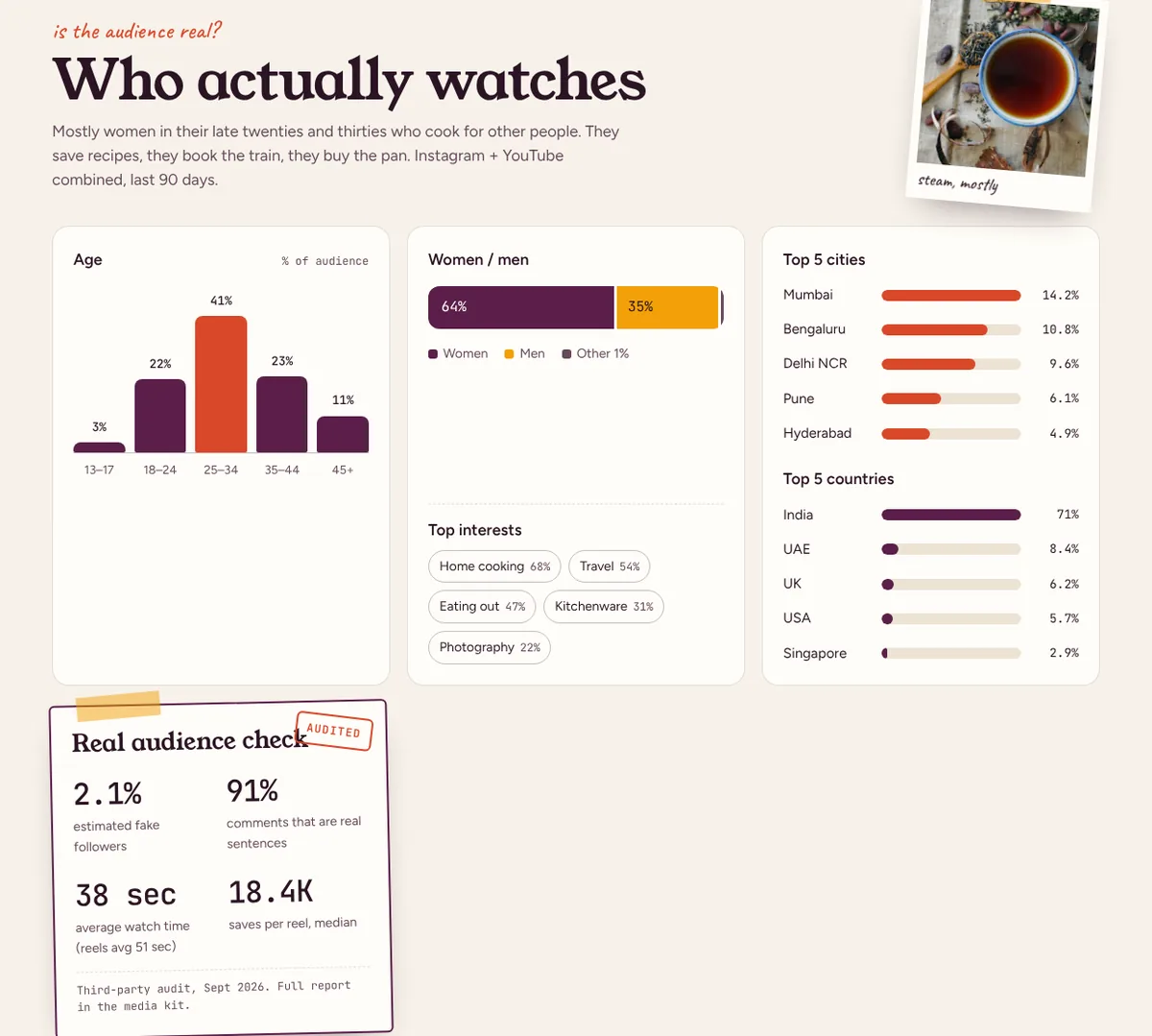
The brand view opens with the question every marketer asks: “is the audience real?” The section shows the audience by age (41% are 25–34), women and men (64% and 35%), top interests (home cooking 68%, travel 54%, kitchenware 31%), and the top five cities and countries, with India at 71% and the UAE, UK, US and Singapore after it.
Then a card titled “Real audience check”, stamped Audited: 2.1% estimated fake followers, 91% of comments that are real sentences, 38 seconds average watch time and 18.4K saves per reel, from a third-party audit with the full report in the media kit.
For the creator: the brand’s biggest worry is answered before they ask, so the first email is about a campaign, not about proving the numbers.
Step 05
A package builder instead of “DM for rates”
This is the part that impresses brands most. Under “Build your package” is Tara’s full rate card: an Instagram reel, a carousel, a story set, a YouTube integration, a dedicated YouTube video and a newsletter feature, each with its price and what is included. The brand adds what they want with plus and minus buttons, then picks usage rights (30 days, 90 days or a year), whitelisting for paid ads and category exclusivity.
On the right, a receipt-style card updates as they go: the items, the total, a note that three or more items get 10% off, and an estimate of views and reach as a range. The currency switches between rupees, dollars, pounds and dirhams. One button, “Send this package as an enquiry”, copies the whole package into the contact form.
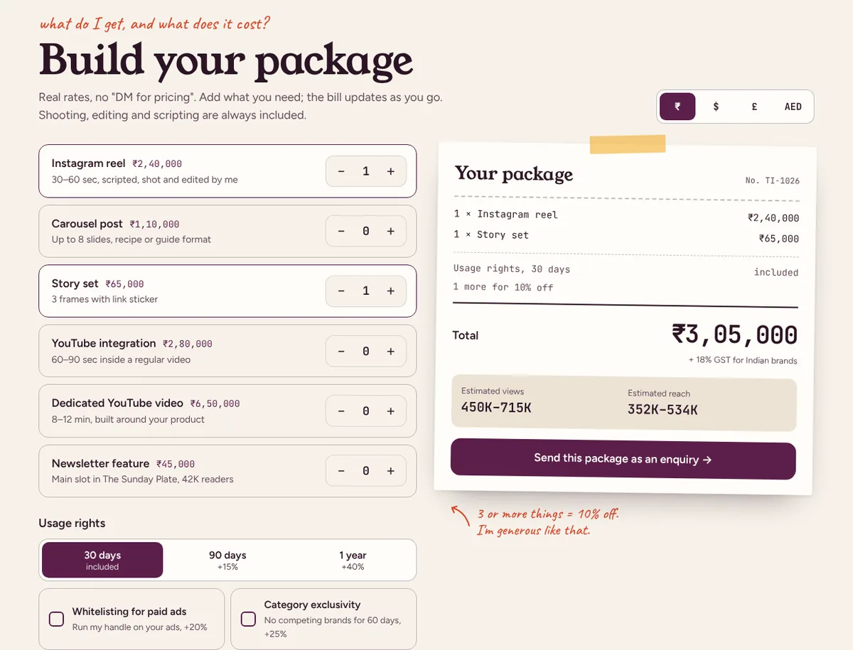
For the creator: enquiries arrive with a package, a budget and dates already filled in, and brands who can’t afford the rates don’t take up her time.
Step 06
Brand work, with receipts
Four campaign cards answer “has it worked for brands like mine?”: a kitchenware brand, a spice brand, a hotel chain and a travel app. Each card has the brief in one line, what was made, four numbers and a handwritten result: “Sold out the batch in 36 hours.” The spice brand card includes what didn’t work: the carousel flopped, so the rest of the budget went into a reel, free of charge.
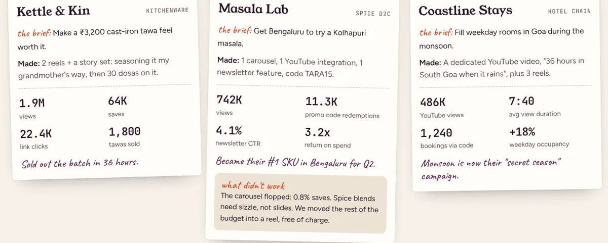
For the creator: brands trust the numbers, and they see a creator who protects their budget, which is the reason they come back.
Step 07
How working together goes, and when
“How easy is she to work with?” gets a five-step timeline: you send the brief (a voice note is fine), an idea and script for approval within 2 days, the shoot in 3–5 days, one round of changes, then posting and a full report within 7 days. A sticky note says “One round of changes included. I only work with brands I’d use myself. That’s why I turn down about 6 in 10 briefs.”
Next to it is an open slots calendar: November almost full with 2 integrations left, December down to the last reel slot, January open with 4 slots.
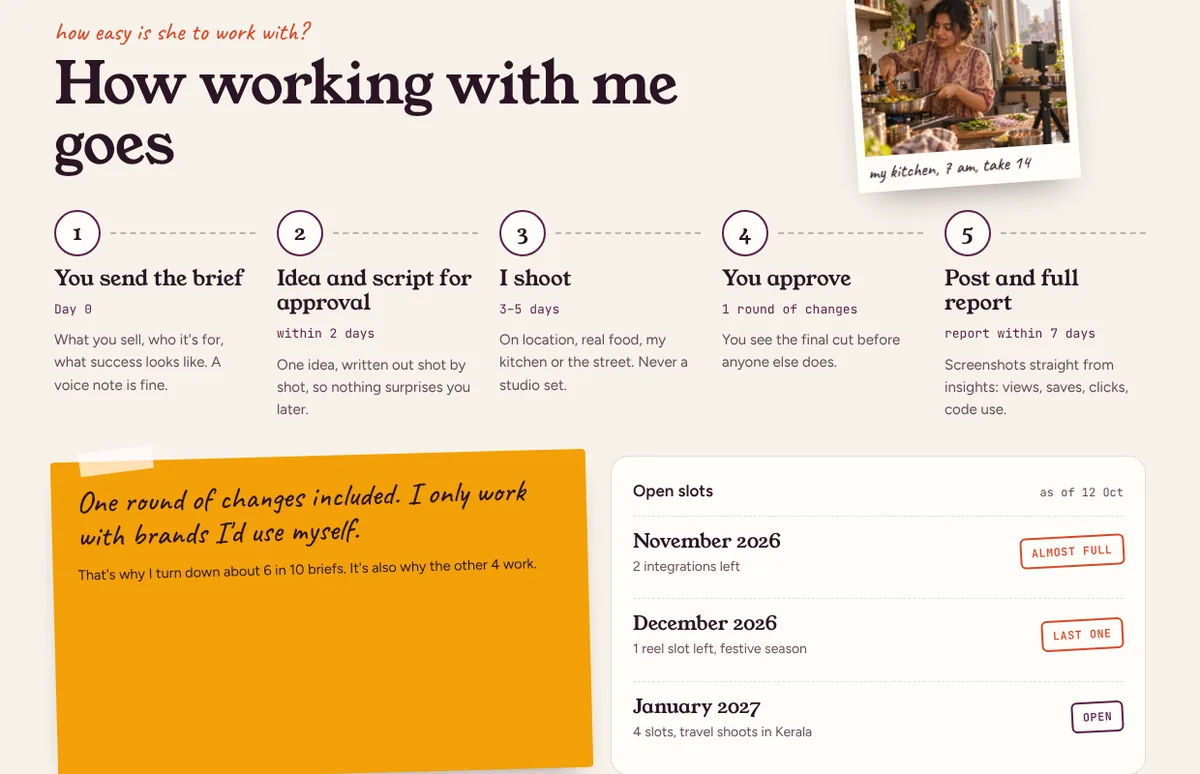
For the creator: brands book earlier, and the slots fill with brands that fit her audience instead of whoever asks first.
Step 08
The content wall
The content wall is a grid of reels and videos in tall phone-shaped frames, each with its category, length and title: Kanda poha that never goes soggy, ₹30 vada pav vs ₹300 vada pav, Konkan railway, window seat, 9 hours. Paid posts carry a small #ad label. Hover, or tap on a phone, and each shows its views, saves and shares. Filters switch between recipes, street food, travel and brand work.
For brands, filtering to brand work shows exactly how a sponsored post looks next to her normal posts, which is the question most of them never get to ask. For fans, it is simply the feed, easier to browse than the app.
For the creator: brands can see that her sponsored posts look like her normal posts, which is why they work, and fans have a reason to come back to the site.
Step 09
A small shop, priced like a good thali
In the fan view the shop comes second. It is called “The little shop”: “Things I made because you kept asking in the comments.” Three products: an e-book, 30-Minute Dinners (₹399, 84 pages), city food guides for Mumbai, Indore, Kochi and Amritsar (₹249 each), and the Lightroom presets she uses (₹499) with a before-and-after photo. Each shows its rating, number of reviews and one short quote.
Below the shop are the latest recipes, each with time, difficulty and a link to the reel, and three city guides like Indore after 10 pm and 48 hours in Fort Kochi.
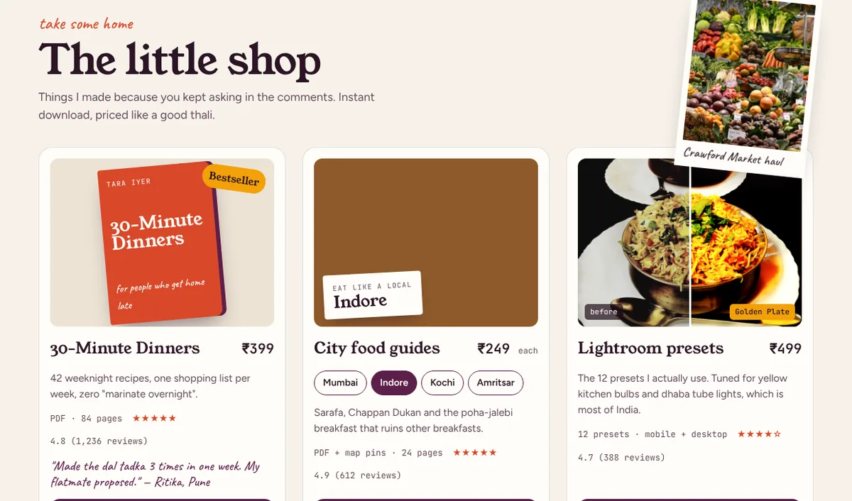
For the creator: income that doesn’t depend on brand deals, and a list of paying fans who will buy the next thing she makes.
Step 10
A newsletter she owns
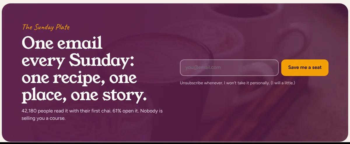
The Sunday Plate gets a full section in plum: “One email every Sunday: one recipe, one place, one story.” It says 42,180 people read it with their first chai and 61% open it, and the small print under the sign-up says “Unsubscribe whenever. I won’t take it personally. (I will a little.)”
Step 11
An enquiry form that’s already filled in
“Let’s talk” has a brand enquiry form with name, brand, website, budget range, campaign dates and the package, already filled in if the brand used the builder. Above the form it says when she will reply: reply by Wed, 14 Oct. Next to it are a small “Say hi” box for fans, with a photo of Tara waving, and a media kit download with the full audience report, past results and rate card.
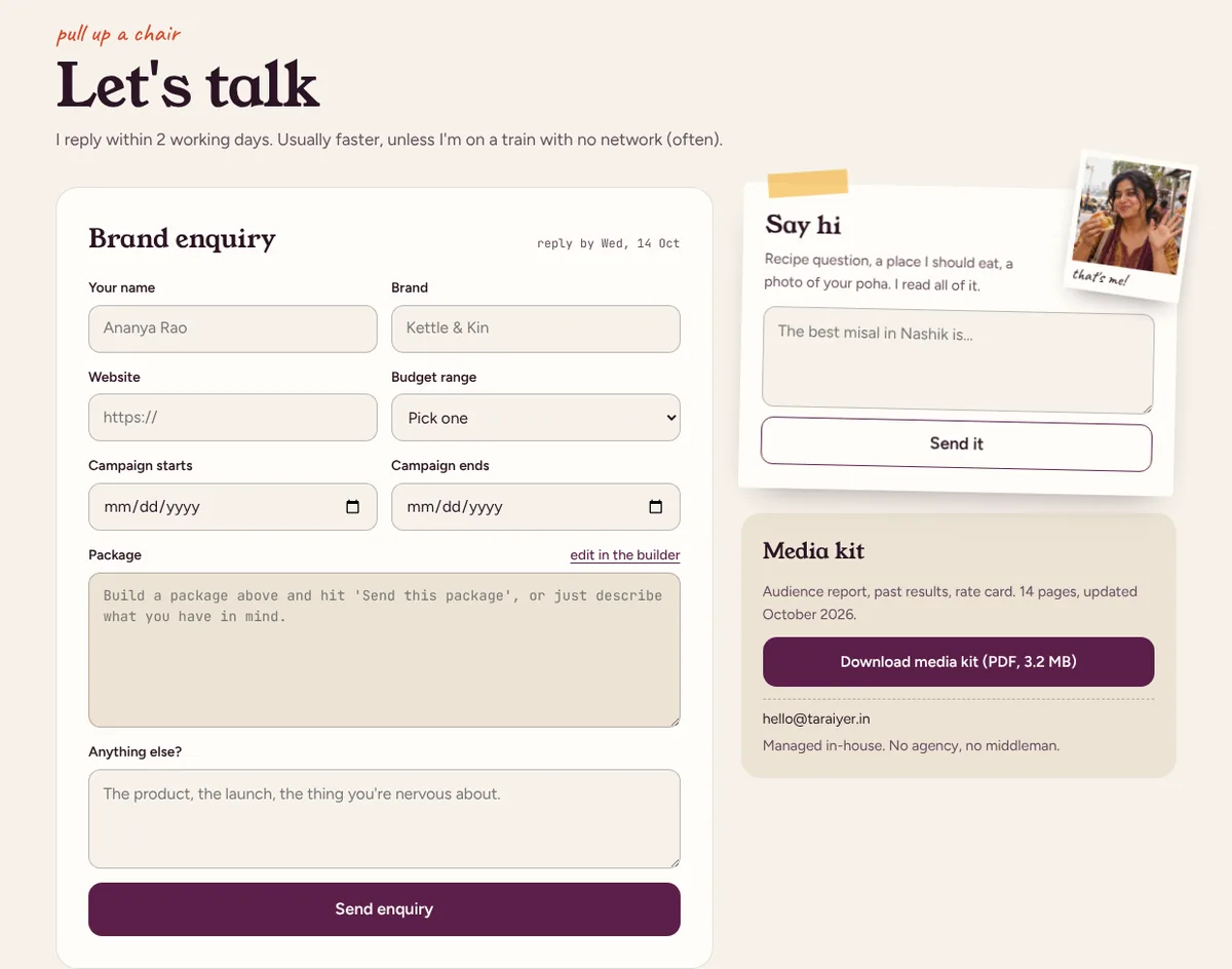
For the creator: enquiries that are complete enough to answer with a yes, a no or a counter-offer, on the date she promised.
Step 12
It works on a phone
Almost everyone reaches a creator’s site from the link in bio, on a phone. On a small screen the brand and fan switch moves into the top bar, the headline still fills the screen, the audience charts stack into cards, and the package builder becomes a list with big plus and minus buttons and the receipt underneath. Rows of reels and brand campaigns swipe sideways.
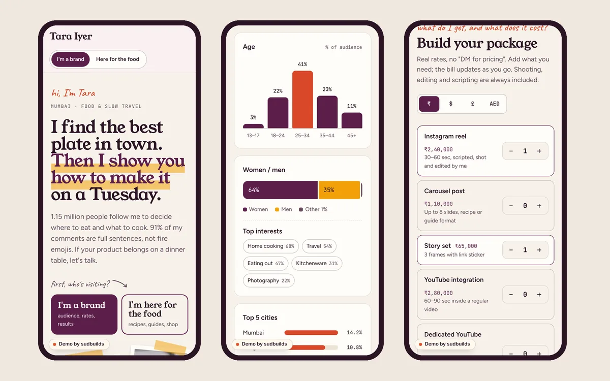
For the creator: the link in her bio does the work of a media kit for brands and a home page for fans.
At a glance
The psychology at a glance
Every principle used on the site, where it shows up, and what it does.
| Principle | Where it’s used | What it does |
|---|---|---|
| Tailoring | Brand and fan switch | Each visitor gets their page |
| Parasocial relationship | First-person voice, handwritten notes | The trust brands pay for |
| Precise, verifiable numbers | Stats strip, “ask for the screenshots” | Numbers read as facts |
| Costly signal | Audited fake-follower rate | The audience is believed |
| “I designed it myself” effect | Package builder | Brands are invested in their deal |
| Two-sided message | The carousel that flopped | The wins are believed |
| Honest scarcity | Open slots, “last one” | Brands book earlier |
| Selectivity | Turns down 6 in 10 briefs | Her yes means something |
| Reciprocity and foot in the door | Free recipes, then a ₹249 guide | Fans become buyers |
| Social proof | Newsletter readers, reviews | Others already trust it |
| Fogg Behavior Model | Pre-filled enquiry, reply-by date | Complete enquiries |
Your turn
Steal this for your own creator website
You don’t need a full rebuild to use these. Most can be added to the site you have, or even to a link-in-bio page.
- Ask visitors whether they are a brand or a fan, and show each what they came for first.
- Show your audience by age, gender, city and country, and the date you updated it.
- Publish one number that is hard to fake: saves, watch time or an audited fake-follower rate.
- Publish your rates, or at least a starting price for each format.
- Show two or three past campaigns with real results, including one that didn’t go to plan.
- Write down your process and your reply time, and keep a calendar of open slots.
- Sell one small thing your fans already ask for.
- Start a newsletter with one specific promise, so you own a channel no algorithm controls.
Questions
Questions people ask
How much does a creator website like this cost?
It depends on what you sell and what it connects to. A site with a rate card and a contact form is very different from one with a shop, a newsletter and audience numbers that update from your accounts. Send me your platforms and how you work with brands, and I’ll give you a fixed price before any work starts.
Can the audience numbers update automatically?
Often, yes. Instagram and YouTube both offer insights through their APIs for creator and business accounts, so follower counts, views and audience splits can refresh on a schedule. Anything that can’t be connected can be updated by hand once a month.
Should creators really publish their rates?
Publishing at least a starting price saves you from enquiries that were never going to fit your budget, and the brands that stay arrive ready to talk about the campaign. If your rates vary a lot, publish a range and what changes it.
Can I sell e-books, guides or presets from the site?
Yes. Digital products can be sold with a payment page that delivers the file straight after purchase, in rupees and other currencies. The demo shop is switched off, but a real one takes a few days to set up.
Is a website worth it if I already have a link-in-bio page?
A link-in-bio page sends people somewhere else. A website keeps them, shows brands your audience and results in one place, ranks on Google for your name and niche, and is the only home online that no platform can take away.
Are Tara, her numbers and the brands real?
No. Tara Iyer is a fictional creator, and the audience data, rates, brands, results and reviews are placeholders. For a real creator, everything is replaced with your own content, numbers and work before launch.
Further reading
Sources and further reading
The principles above come from published research in psychology and behavioural economics. If you want to read further:
- Noar, S. M., Benac, C. N. & Harris, M. S. (2007). Does tailoring matter? Meta-analytic review of tailored print health behavior change interventions. Psychological Bulletin.
- Horton, D. & Wohl, R. R. (1956). Mass communication and para-social interaction. Psychiatry.
- Spence, M. (1973). Job market signaling. Quarterly Journal of Economics.
- Franke, N., Schreier, M. & Kaiser, U. (2010). The “I designed it myself” effect in mass customization. Management Science.
- Eisend, M. (2006). Two-sided advertising: a meta-analysis. International Journal of Research in Marketing.
- Worchel, S., Lee, J. & Adewole, A. (1975). Effects of supply and demand on ratings of object value. Journal of Personality and Social Psychology.
- Cialdini, R. B. (1984). Influence: The Psychology of Persuasion.
- Freedman, J. L. & Fraser, S. C. (1966). Compliance without pressure: the foot-in-the-door technique. Journal of Personality and Social Psychology.
- Fogg, B. J. (2009). A behavior model for persuasive design. Proceedings of Persuasive 2009.